A healthcare brand has to convince

the frightened and the skeptical at the same time.

The family outside the ICU, the hospital's buying committee, and the investor betting on the raise all need opposite things from you. Most healthcare brands chase one and lose the others, or split the difference into something generic. We build brands specific enough to reach all of them.

See our work

The best climate companies stopped leading with climate.

The market moved. The money started going elsewhere. Theword "green" stopped meaning anything. We build brands thatwin on the strength of the technology and the size of theopportunity, with sustainability as the proof.

See the work
Our Perspective
Healthcare branding is the work of being understood by people in completely different states of mind: the scared patient, the rushed clinician, the skeptical exec, and the investor sizing up the opportunity.

Designing for two states of mind

Picture two people a healthcare brand has to reach in a single day: one is a daughter outside an ICU, opening a site on her phone that a nurse just mentioned. The other is a procurement committee three months into evaluating vendors. The daughter wants to feel less alone, quickly. The committee wants references, proof, and a decision they can defend. Healthcare brands have to work for both.

Most healthcare brands in this situation reflexively try to look ‘official’ with the visual shorthand for “safe” and “medical”: institutional blue gradients, calm photography, smiling clinicians, and sterile minimalism. To the frightened person this feels like the same system that’s already confused and billed her. To a committee, it looks like every other vendor in the shortlist.

The healthcare work in our portfolio goes the other way, toward specificity rather than neutrality. VoiceLove reaches families, patients, and caregivers in acute care, each through their own entrance, without devolving into a generic wellness brand. Phrase Health carries an executive’s business case and a clinician’s daily reality on one site, because the person who signs the contract is not the person who lives in the software. Swedish Plastics & Aesthetics gives an aesthetics client and a surgical patient two different beginnings that still add up to one practice.

Our position is that a healthcare brand earns its place by being specific, not safe. Specific about who is on the other side of the screen. Specific about what the work actually does. And pointed enough in its own view that people with nothing in common can still recognize the same company.


Principles for Branding Healthcare

The most important audience is the one at the bedside

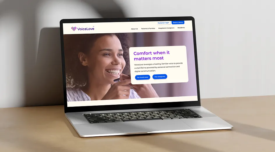
VoiceLove keeps families and patients connected when visits are limited and speech is not possible, facing loneliness and isolation, across ICUs, PICUs, and residential care. We designed for that human connection first, not the institution writing the check, using soft neutrals, real photography, and the logo's sound bars to make the experience feel personal instead of procedural.

In healthcare, the buyer and the user are rarely the same person

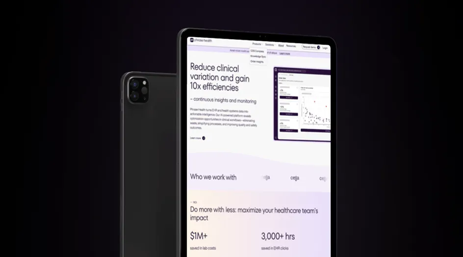
Phrase Health is chosen by the C-suite but lived in every day by clinicians, so we changed their dense EHR workflows to hold two registers at once: an executive's business case up top, and the workflow-level proof a clinician trusts underneath.

Cultural specificity is essential; it decides whether the brand works

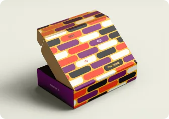
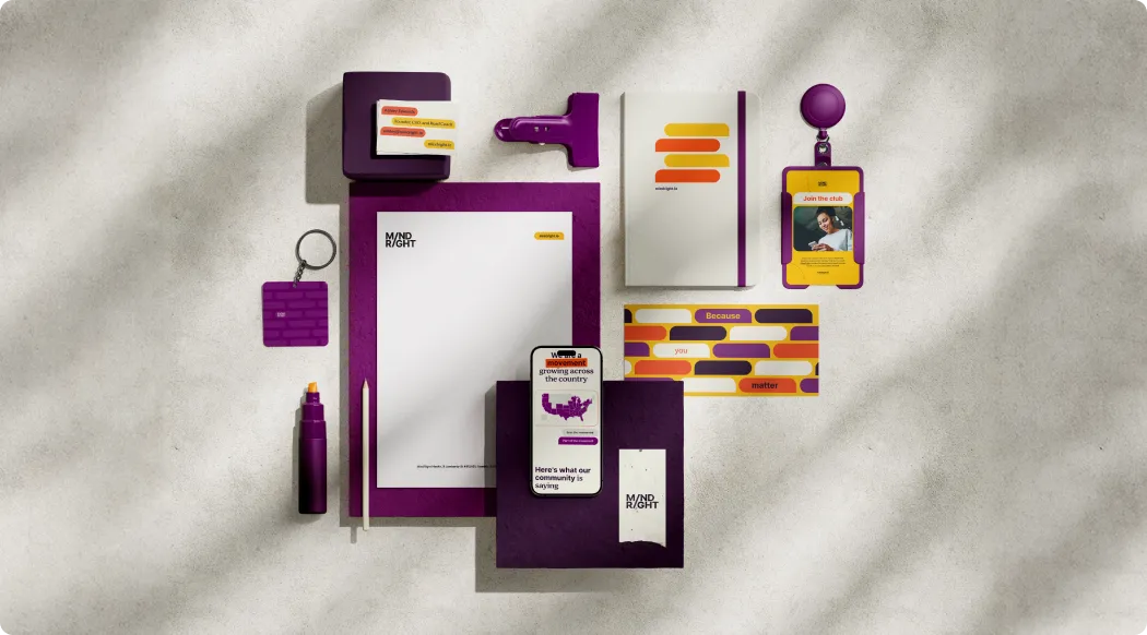
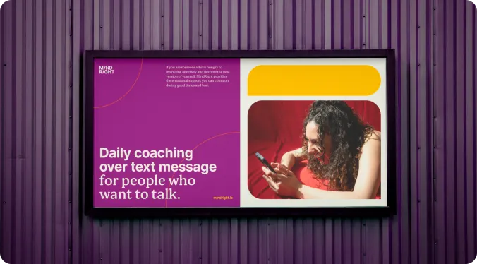
MindRight set out to reduce stigma for Black and Latinx adults in their 20s and 30s, which meant refusing the calm-pastel look every other mental health app defaults to. An identity that feels joyful and recognizably theirs is what turns interest into a sign-up instead of a scroll past.

Warmth is not the opposite of credibility

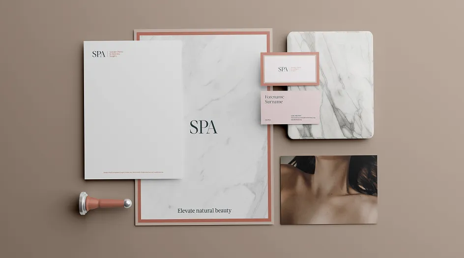
Swedish Plastics & Aesthetics had to feel as easy as a spa and as serious as an operating room, often for the same person on the same visit. We built an “approachable luxury” system with separate routes for aesthetic clients and surgical patients, where the ease is what makes the clinical credibility land.

A healthcare brand has to hold up when it leaves the screen

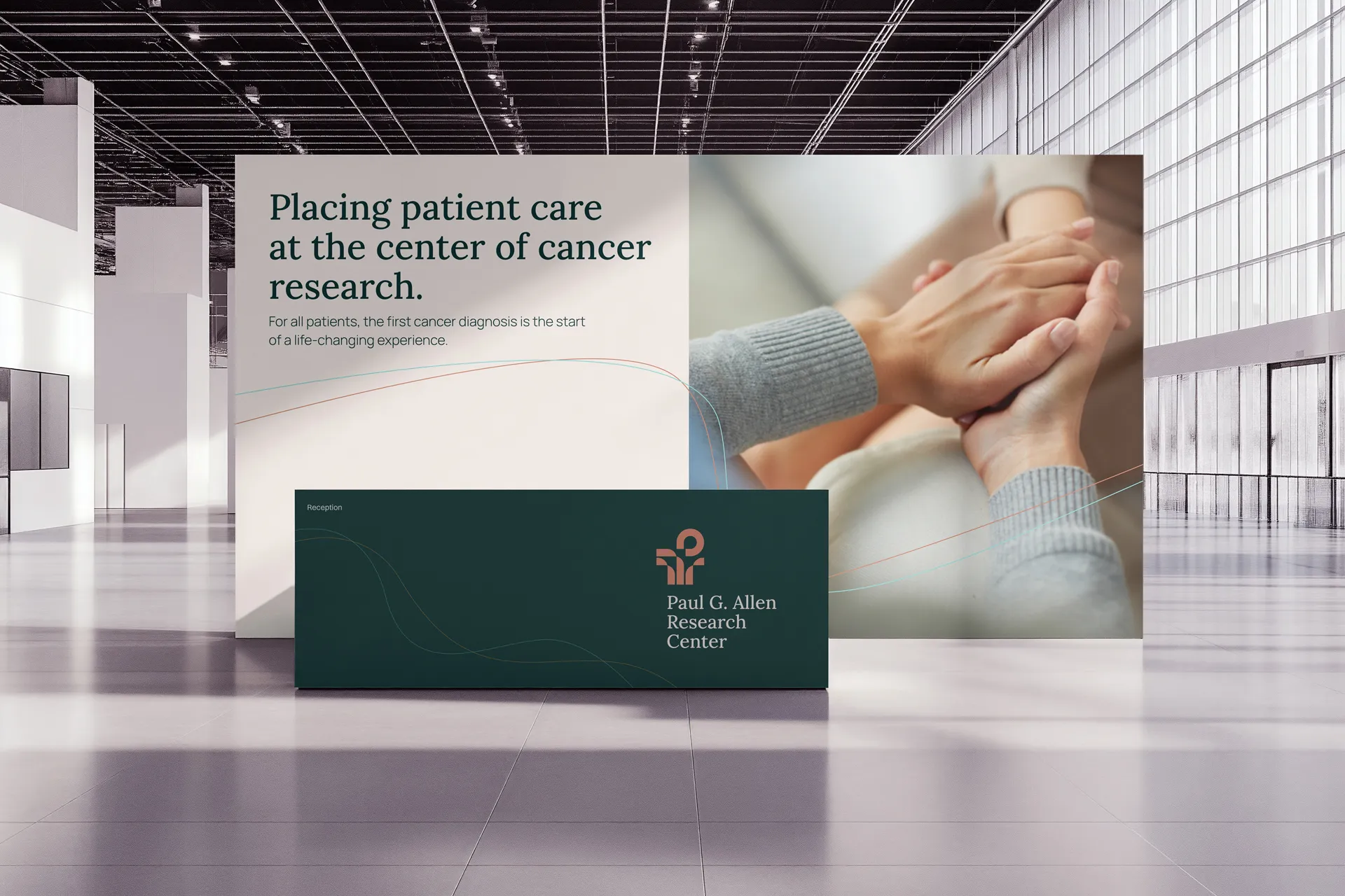
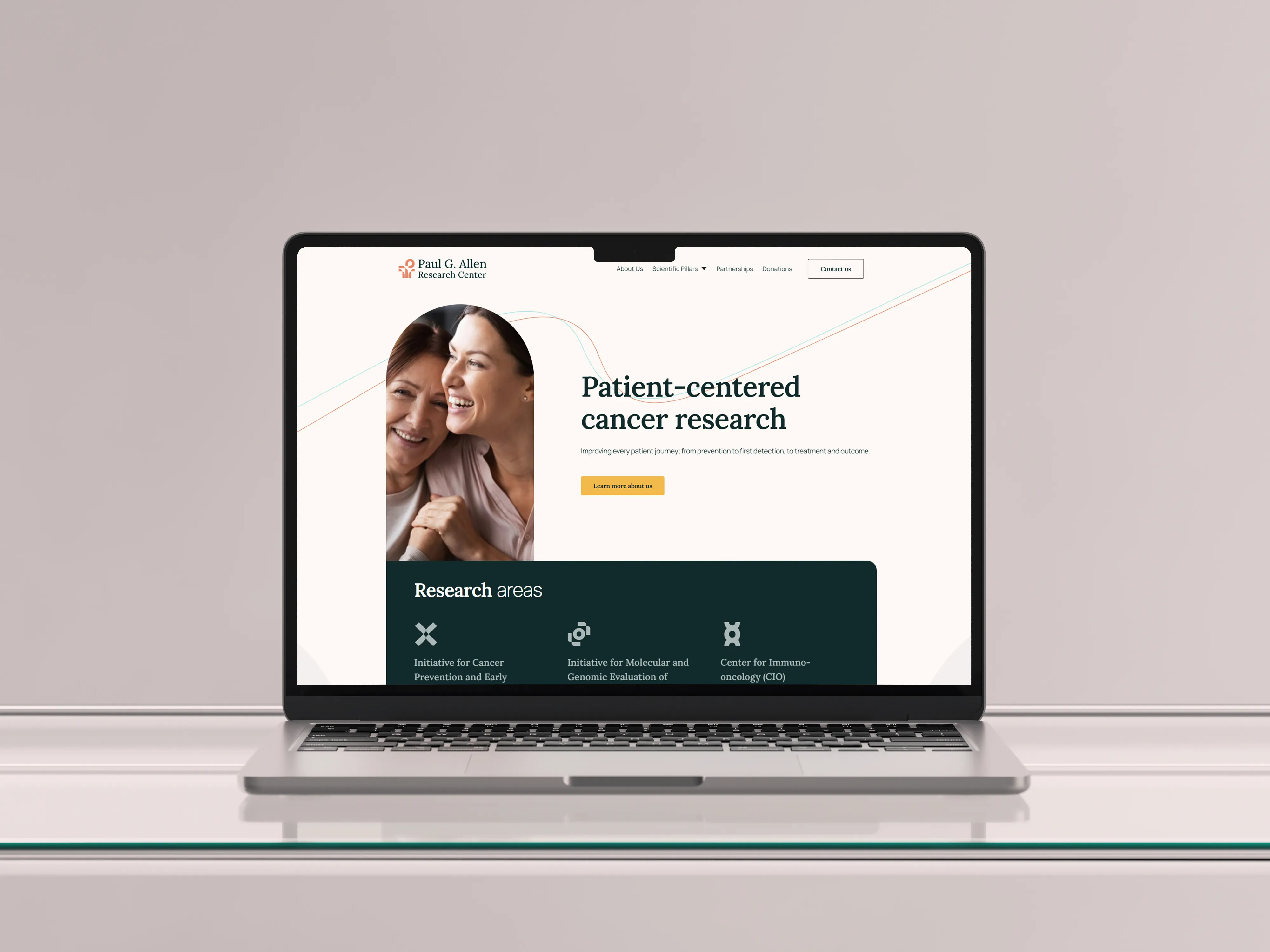
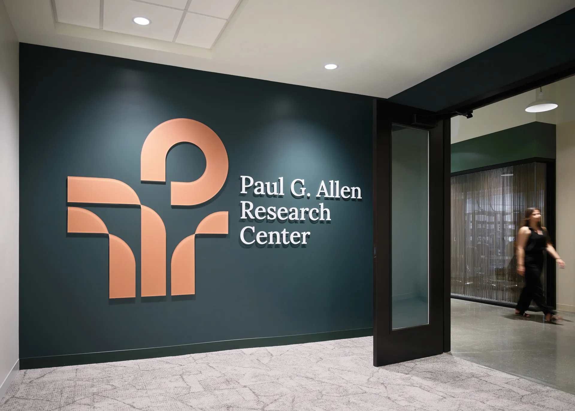
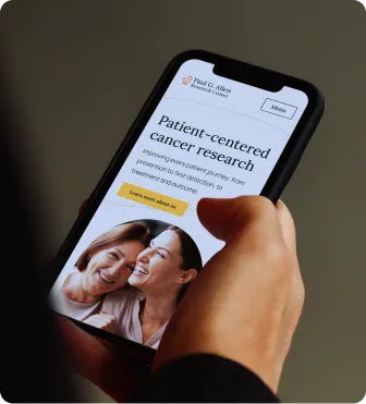
We built PARC from nothing with an identity beyond just the website; its palette and linework shaped the cancer center’s physical interior as well. Someone who meets the brand online now feels the same way walking into the waiting room.

Sometimes the brand that's already working is the problem

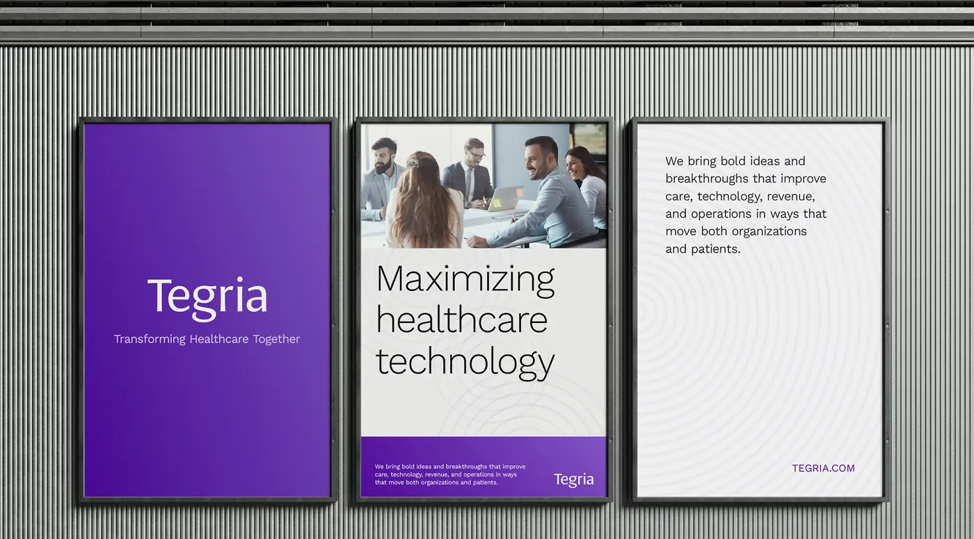
Tegria had real traction as a company that “humanizes healthcare,” but it was precisely what held it back, casting a firm doing $500M to $1B in revenue as a feel-good vendor rather than a strategic partner. We repositioned it by narrowing the story to what only Tegria could claim, then aligning teams behind it over an 18-month rollout.

Our Healthcare Portfolio

MindRight

A pioneering mental health startup, shifting from institutional partnerships to a consumer subscription, with a brand that looked like every other calm, pastel wellness app.
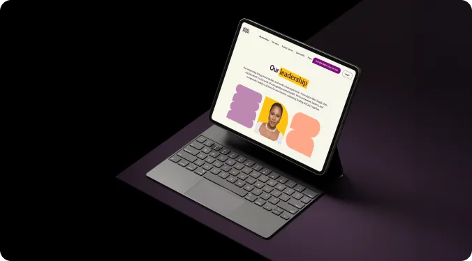
We rebuilt MindRight away from the category cliché into a vibrant, culturally specific identity that feels joyful and authentic rather than clinical. We designed for the Black and Latinx communities it serves, and built a conversion-first Webflow site around storytelling and subscription sign-ups, repositioning a pioneering startup as a consumer movement.
“Wunderdogs was very responsive to the needs of our brand and worked in partnership with us to create a visual identity and website that feels authentic to our diverse team, users, and community.”
Ashley Edwards
CEO, MindRight Health
Mental health
Consumer
Case Study

Tegria

A company doing $500M to $1B in revenue whose “humanizing healthcare” positioning had pigeonholed it as a feel-good services provider, masking its real role as a strategic partner to health systems.
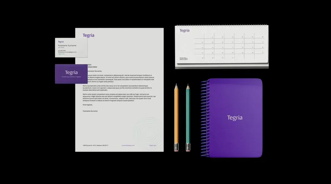
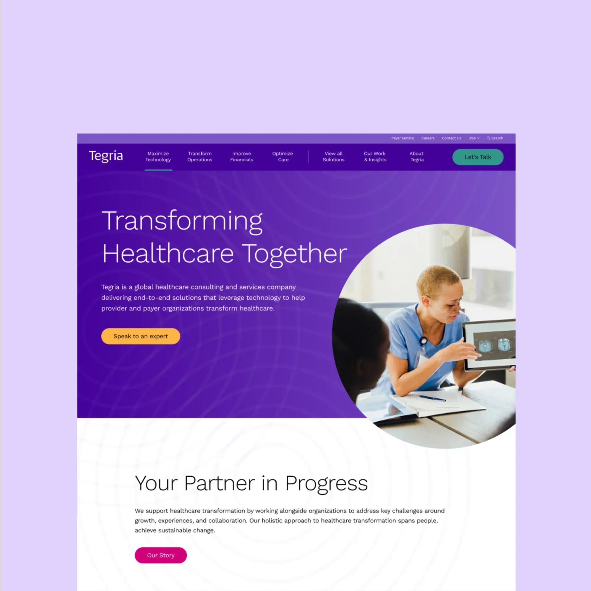
Over an 18-month engagement, the work covered strategic refinement, an evolved visual identity, a website refresh, and updated communications, with stakeholder alignment ahead of each rollout. The repositioning reframed Tegria as a partner built by healthcare, for healthcare.
20% website performance improvement, 32% faster time to interactive, and a 17% lift in SEO score.
Healthcare consulting and technology
Enterprise
Case Study

PARC (Paul G. Allen Research Center)
Build a legacy cancer-research brand from the ground up, scientific enough to earn credibility and warm enough to meet patients where they are.
We created the brand from the foundations up: positioning, persona, and messaging across the full cancer continuum (prevention, detection, treatment). In discussion with Paul Allen’s family, we built a logo combining biological discovery, open arms, and the “P” from Paul's name, paired with a warm palette and human-centered photography. The system carried through the website and went on to shape the center's interior architecture.
Founded via Paul Allen’s $20M gift to Swedish; the identity extended from screen into the center's physical space.
Cancer research institution
Case Study
VoiceLove
Acute-care connection platform for patients, families, and caregivers across ICUs, PICUs, and residential care. We built dedicated pathways for each audience, keeping the experience personal, not procedural.
“Wunderdogs are brilliant! They are indeed the top dogs in branding.”
Gabriela Pelin
CEO, VoiceLove
Acute-care connection
Consumer
Swedish Plastics & Aesthetics
All-female, board-certified aesthetics and surgical practice inside the Swedish Providence system. We built an “approachable luxury” identity with distinct journeys for clients and patients, launched with the facility opening.
“The team delivered excellent output that wowed our colleagues and patients.”
I-Nong Lee
Sr. Program Manager, Swedish
Medical aesthetics
Consumer
Phrase Health
Clinical informatics platform used by hospital executives and clinicians alike. We built role-specific paths for the C-suite and informatics leaders, with custom interface mockups that turn EHR complexity into a modern, credible site.
Phrase Health’s redesigned site enabling prospects to move efficiently from awareness to technical evaluation.
Clinical informatics
B2B

FAQs

How do you build trust in a healthcare brand?

By being specific instead of official. People arrive at healthcare guarded, so the brands that earn trust name exactly who they serve, say plainly what they do, and sound like a person who understands the reader rather than an institution addressing a market. Looking authoritative and being believed are not the same thing.

How do you brand a medical practice?

Design around the decision the patient is actually making. For Swedish Plastics & Aesthetics, that meant separate journeys for aesthetic clients and surgical patients, and a look that carries both spa-level ease and surgical credibility, so a self-pay patient feels confident choosing and comfortable arriving.

How is health tech branding different from branding other B2B software?

The person who buys is usually not the person who uses it. A platform like Phrase Health is chosen by executives (CMO, CIO, CMIO) but lived in by clinicians, so the brand has to make a business case and prove day-to-day usability at once, inside institutions that treat change as risk.

How do you rebrand a health system without losing the trust you already have?

Subtract before you add. Tegria’s problem was not a weak brand but a strong one pointing at the wrong reputation, so the work narrowed the story to what only they could claim and rolled it out over 18 months with stakeholders aligned first, keeping the equity that worked while changing what it stood for.

What should a patient-facing or mental health brand avoid?

The category’s reflexive defaults: pastel calm, stock smiles, and a tone that talks down to people. MindRight reached its audience by doing the opposite, with an identity that felt joyful, culturally specific, and clearly made by people who understood the communities it serves.

Great care deserves a brand people trust on sight.

Contact us