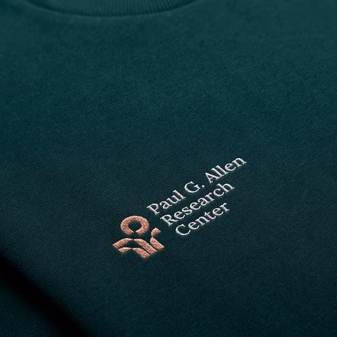
Paul G Allen Research Center

Co-founder of Microsoft, Paul Allen spent many years fighting cancer and throughout his journey was supported by Swedish Health Services. Upon his death he donated $20M to Swedish as a thank you but also as a donation to be used to continue the research on cancer and its effects on human health. In his name, the Paul G. Allen Research Center (PARC) was set up to honor his legacy. Having worked on the proposition, the team at PARC approached Wunderdogs to create the PARC brand from the ground up.
Clarifying impact and ambition
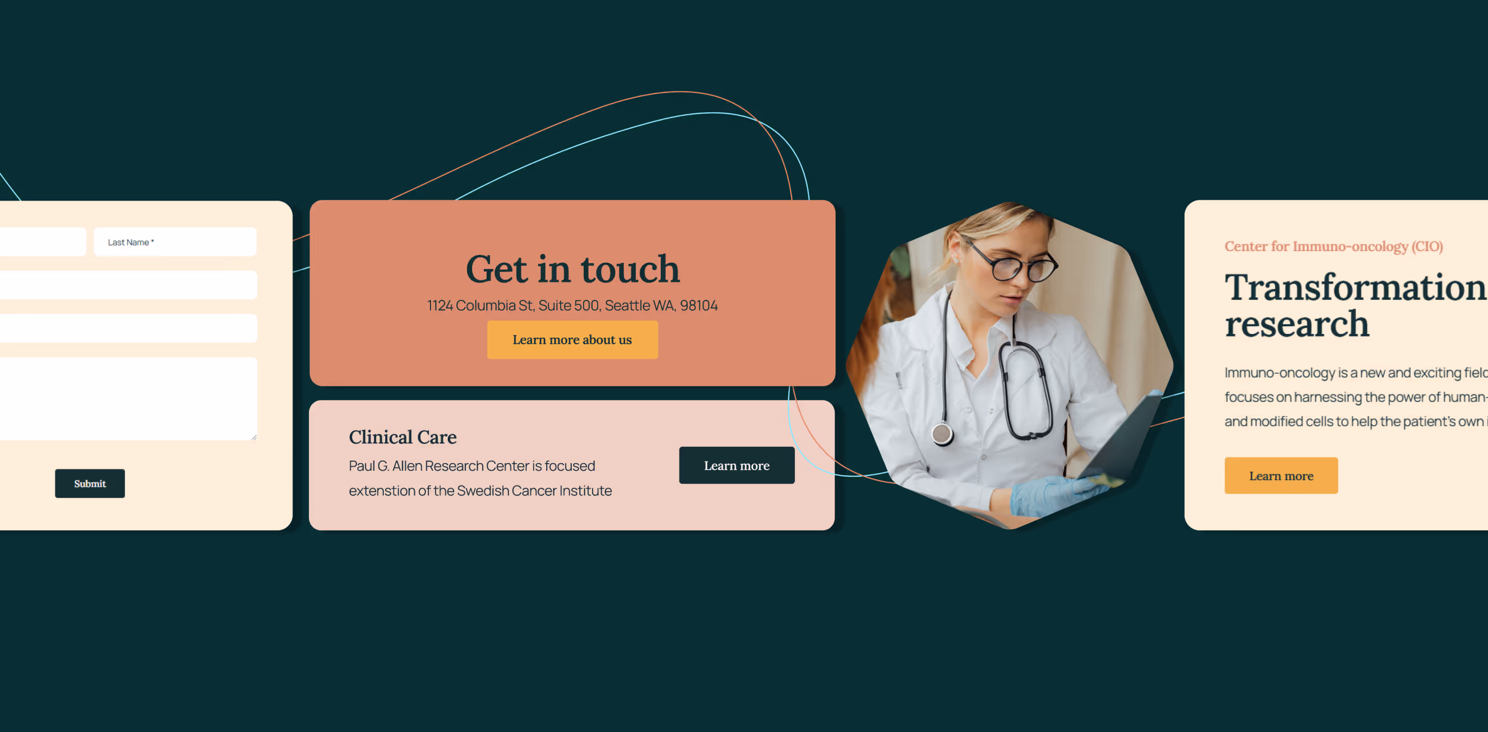
The center specializes in a few key areas with the cancer patient always at the heart of everything they do. The team conducts research across the whole cancer continuum from prevention, to detection and to treatment to improve outcomes. We worked with the team in the initial stages to understand the primary focus for PARC on its path to its ultimate ambition. By clarifying the brand foundations, positioning, persona, and messaging we defined a clear, easy-to-understand story that would provide the basis for the team moving forward.
Advocating a human approach
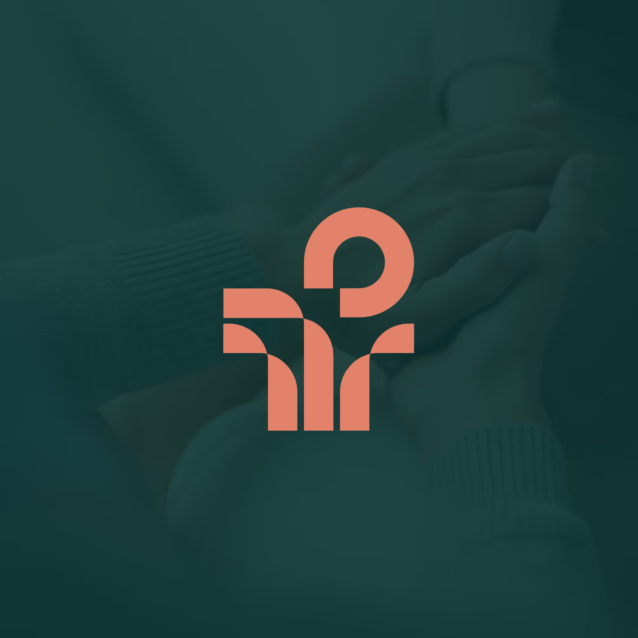
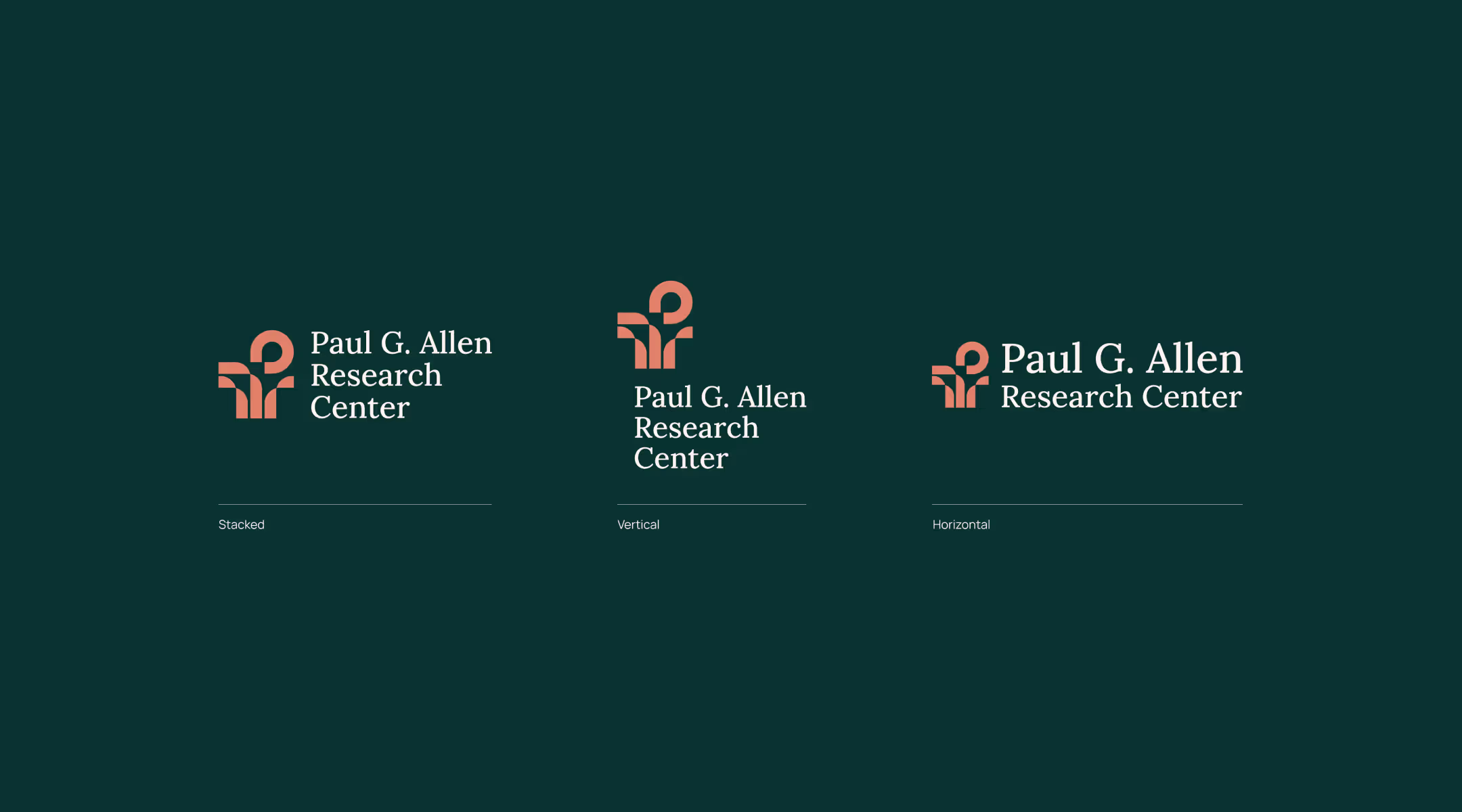
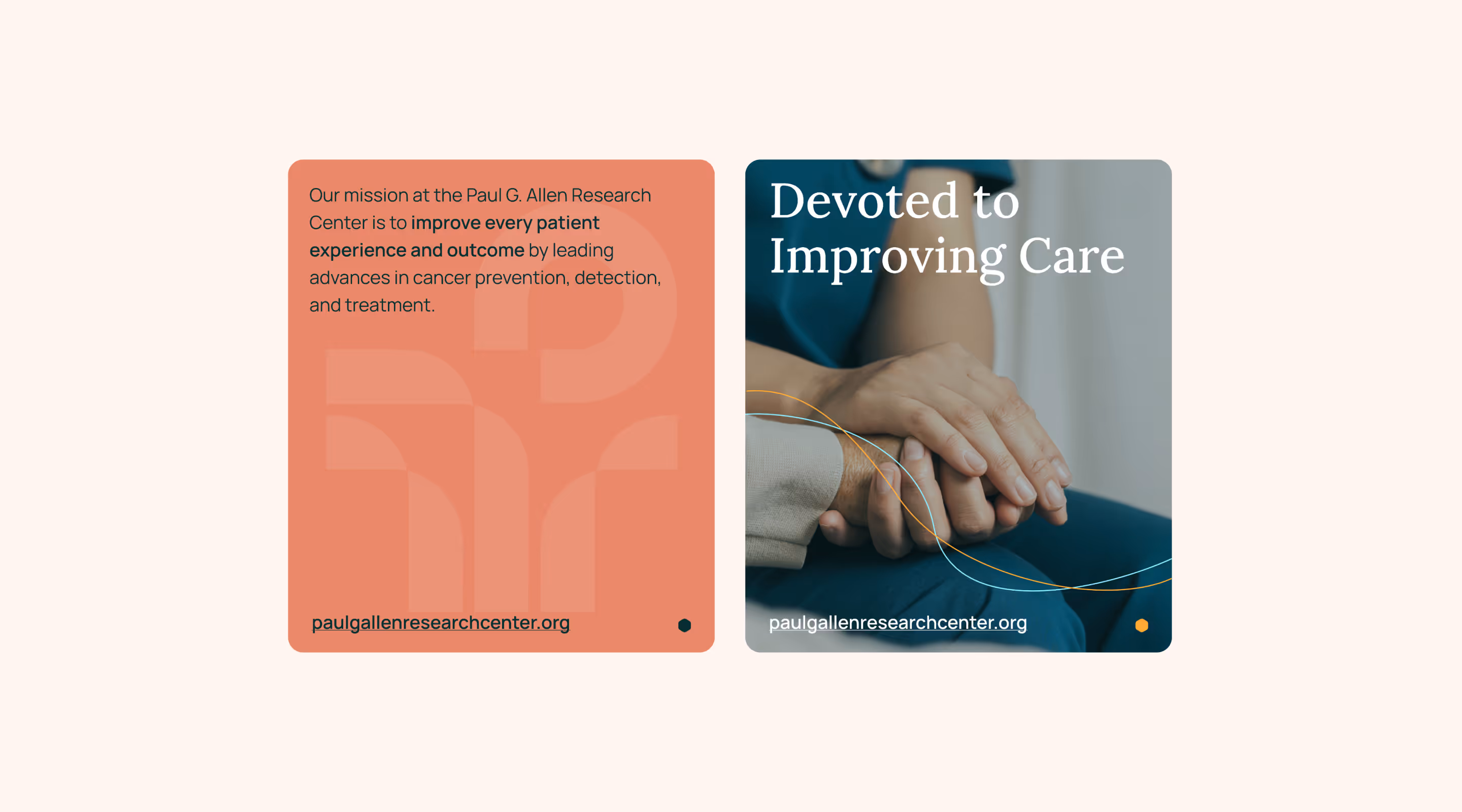
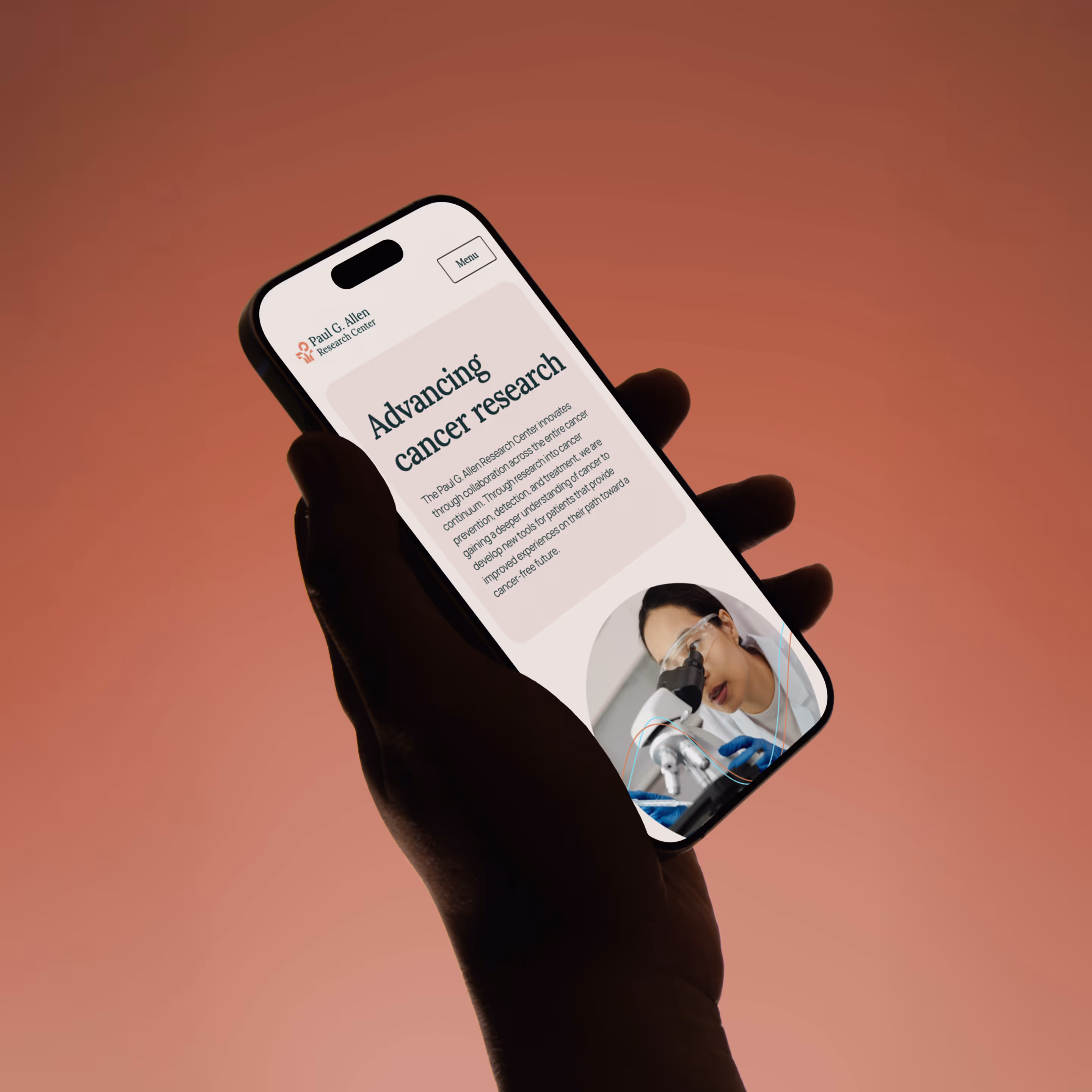
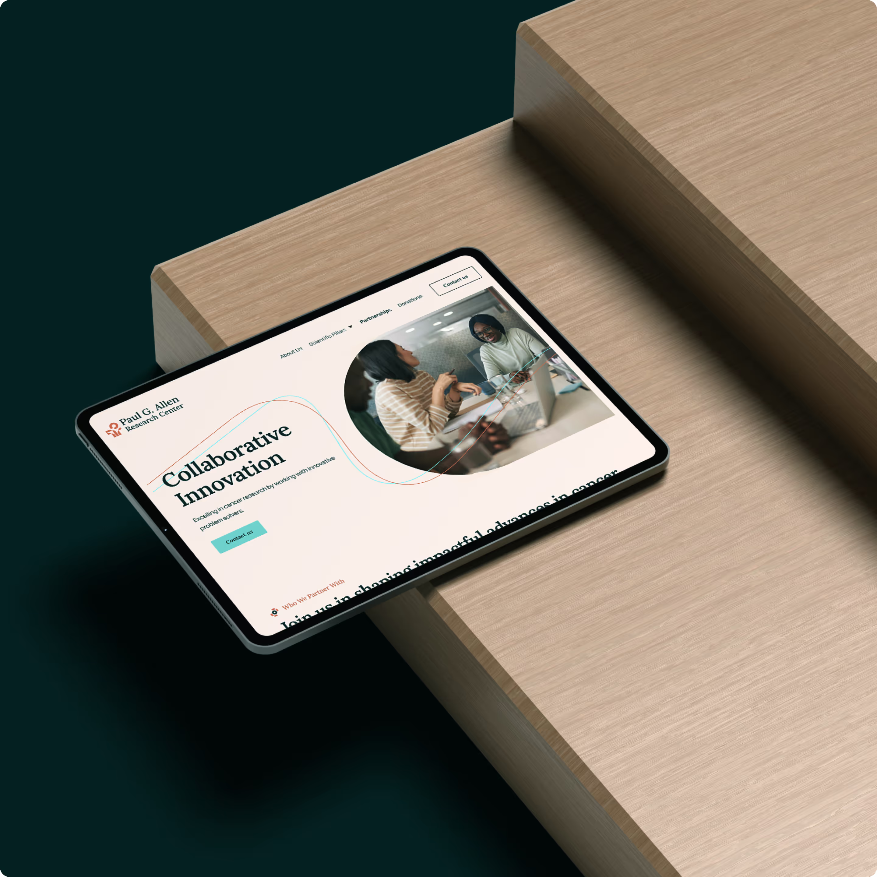
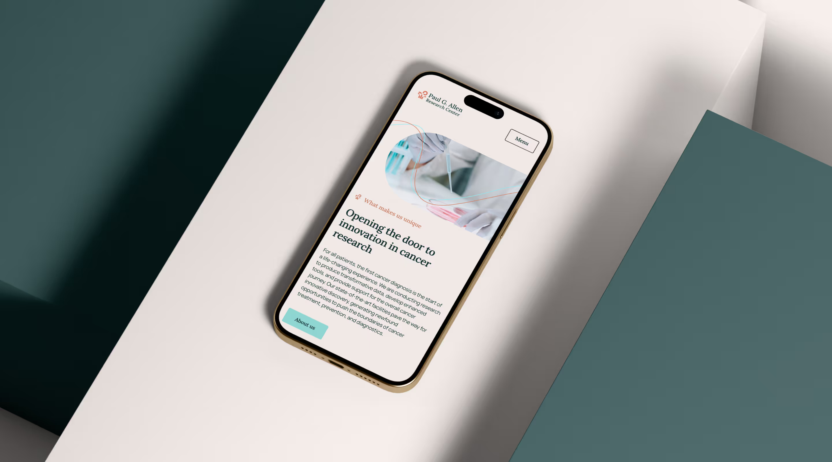
Paul Allen was a dedicated advocate for better experiences and outcomes for those battling cancer. As such, we aimed to create a visual identity that upheld his dedication and the team's compassion for better cancer care. After exploration and discussions with Paul's family, we landed on a logo that combines elements of biological discovery, open arms indicating support, and the ‘P’ from Paul's name. This was paired with a warm, welcoming color palette and photography that not only brings to life the research the center is doing but also builds a connection with the individuals the center supports.
Conveying information simply
As PARC operates at each step of a person's cancer journey there are a lot of different aspects of their approach to communicate to a wide range of audiences. Mapping the site and wireframes for the web required a collaborative approach to find the right balance between complexity and simplicity. Using our color palette to define specific blocks for key information supported by imagery helps draw the user's eye to the information that matters most. The line work of the visual language also helps draw the user through the site in a conscious way, connecting different aspects of the work PARC does. As a result, we’ve developed a site that creates a detailed yet easy-to-navigate experience for the center's audiences.


Building a brand that honors a legacy
We partnered with the Paul G. Allen Research Center to create a brand from the ground up: one that reflects Paul Allen’s enduring commitment to advancing cancer research and improving patient outcomes. The identity balances scientific depth with human compassion, rooted in a mission to support every step of the cancer journey.
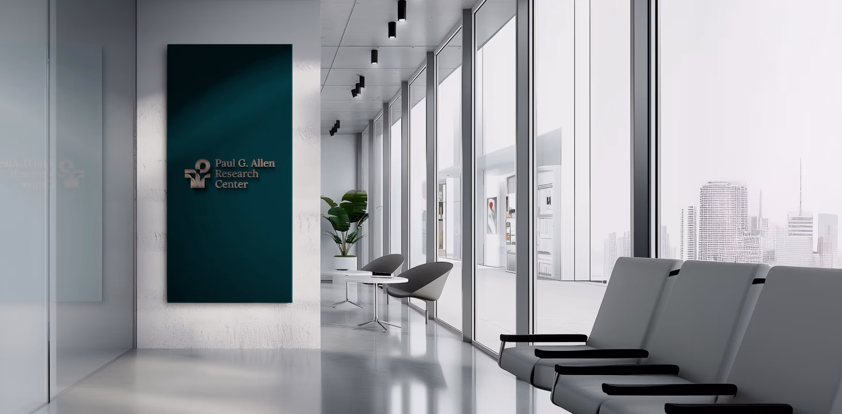
A brand that extends beyond the screen
PARC’s visual identity didn’t just shape their digital presence; it inspired the design of their physical space. From the welcoming color palette to architectural references to the logo’s flowing lines, the center’s interiors now reflect the same warmth, clarity, and purpose as the brand itself.


Other works that you might be interested in
.svg)

.svg)