Firehunter


.avif)
Firehunter is a seed-stage venture firm investing at the intersection of robotics and applied AI. Founded by John Smith, a 30-year operator who has built and scaled technology companies as an experienced general partner, Firehunter backs founders at the moment when product direction, go-to-market strategy, and capital decisions are still being shaped. The firm's thesis: the most consequential support a VC can offer is more than money,it's showing up before the expensive mistakes are made.
The website came first
When John approached Wunderdogs, Firehunter didn't yet exist as a legal entity. There was no fund, no formal LP commitments, and no public presence. What John did have was a thesis, a name with personal history, early LP conversations generating million-dollar verbal commitments, and a strategic anchor LP relationship with robot.com, a robotics company tracking toward a public listing.
The Firehunter website was the precondition for everything. Without it, he couldn't fundraise, form the fund, or attract founders.
That created an unusual constraint for us. The brand had to do what proof points usually do to communicate credibility, expertise, and trust, without the portfolio, the exits, or the track record a more established firm could lean on.
Hunting for the right identity
We started with discovery, and the name itself gave us the most to work with. Firehunter was a brand John had built inside Hewlett Packard in 1998, ran successfully, and never forgotten. When he set out to launch this fund, he reclaimed it. That history, the genuine attachment to it, the fact that it had already meant something, shaped how we approached the visual concept.
The strategic brief pointed in one direction to being bold enough to stand out in a category where most firms had opted for safety, credible enough to satisfy institutional LPs, and approachable enough to make a first-time founder feel like they'd found the right partner. The VC landscape John was entering was full of brands that were either cold and academic or gimmicky and trend-chasing.
A spark, not a cliché
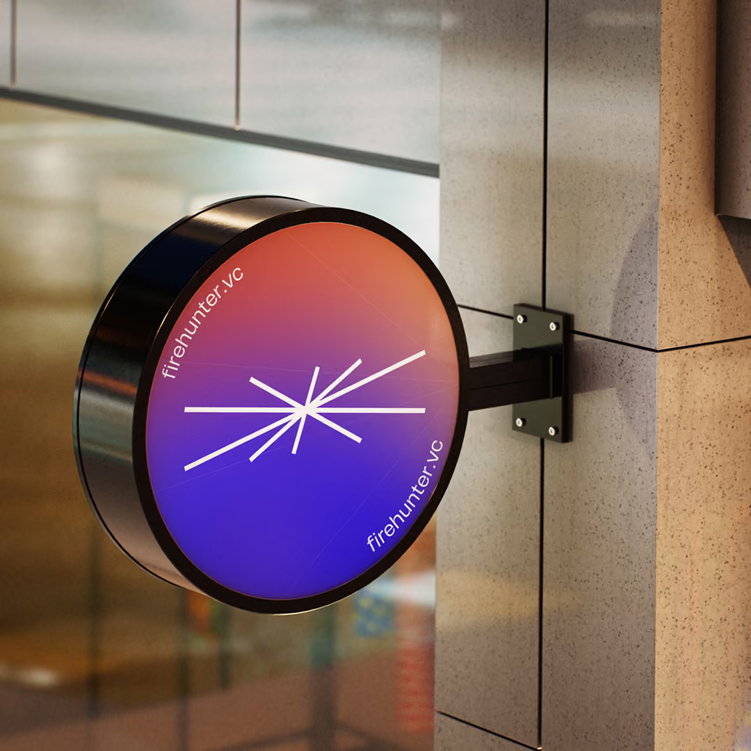
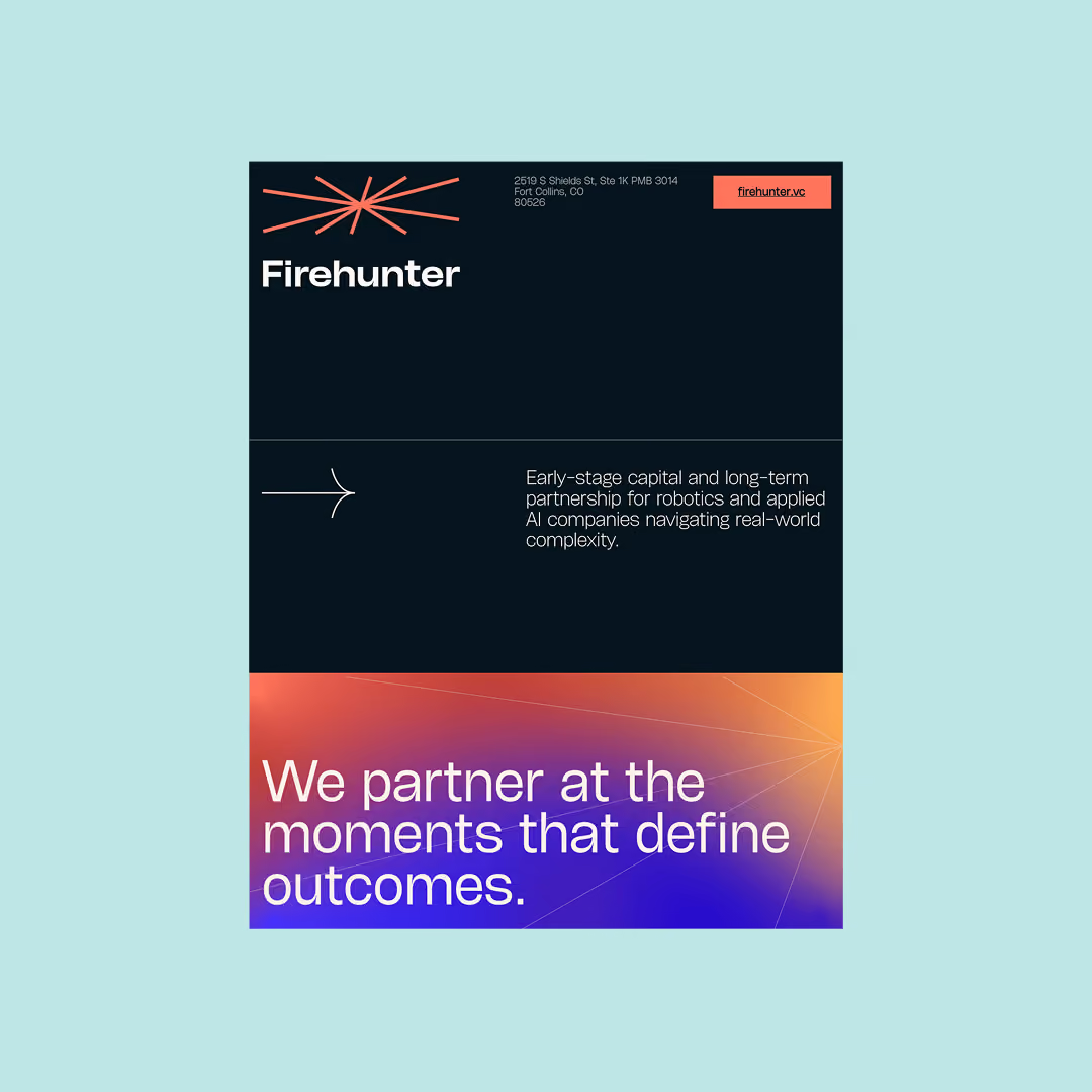
The logomark is an abstract spark, a radiating burst of lines emerging from a center point, designed with deliberate asymmetry to convey dynamic release without becoming a predictable star shape. The original mark was ultimately chosen over more expressive iterations because it was more technically authoritative. In the final build, the mark sparks into existence on load, giving users the moment of recognition the static form holds back.
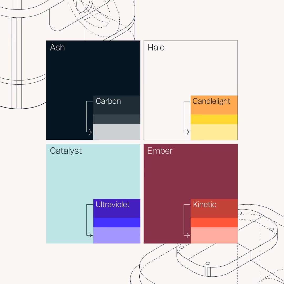
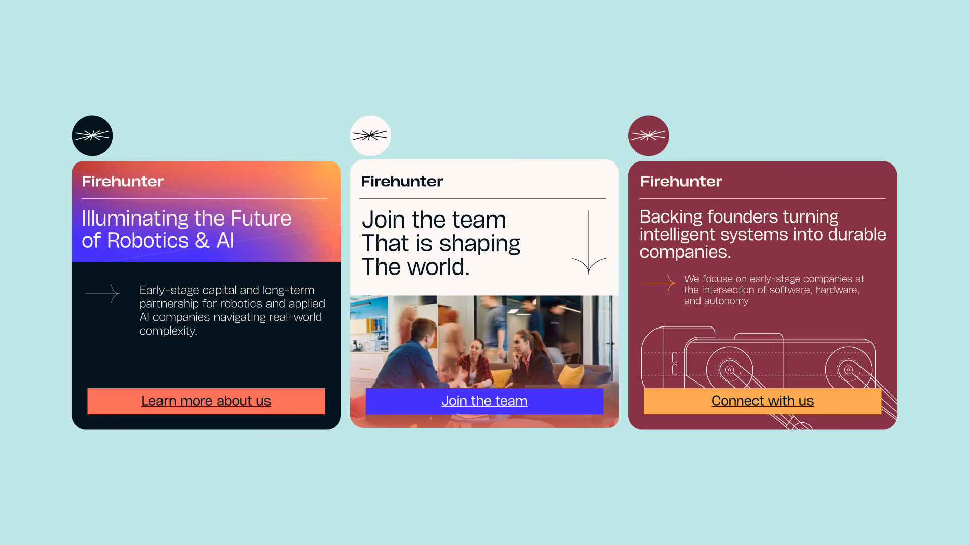
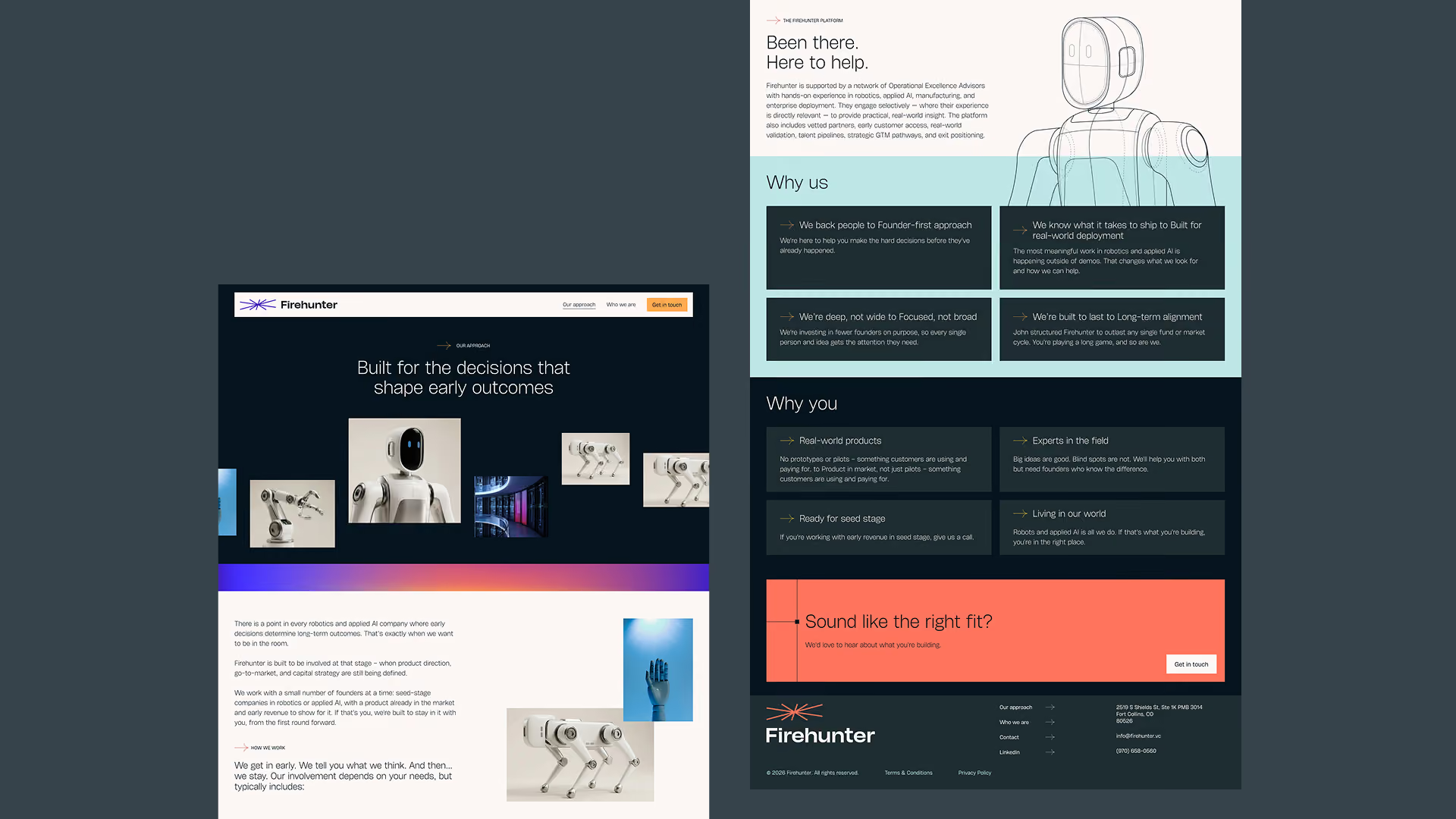
The color system pairs a deep, saturated blue with warm accent tones and gradient treatments that move between them. Typography is anchored by HeroKid, clean and humanist in proportion, precise without feeling engineered. The 60/30/10 color ratio keeps neutrals dominant, letting the gradients function as signal rather than noise.
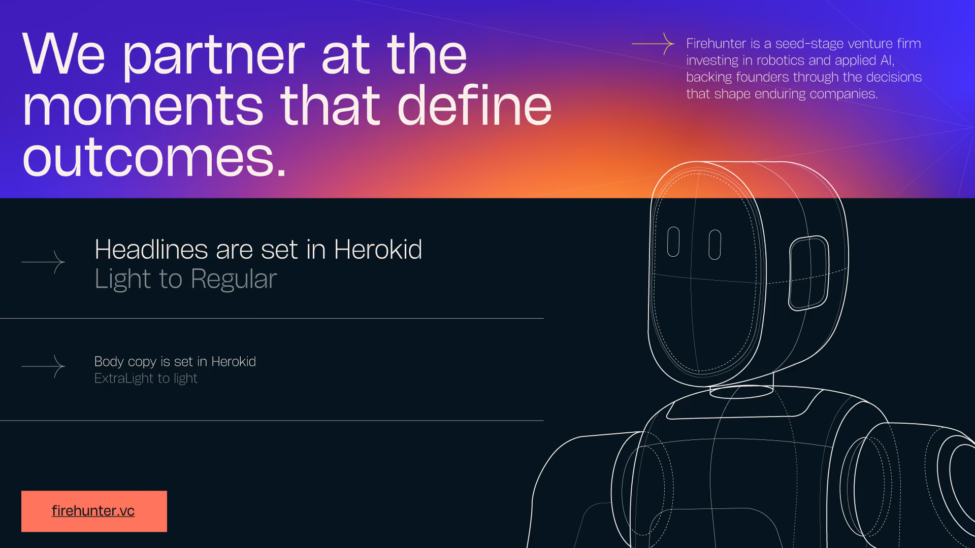
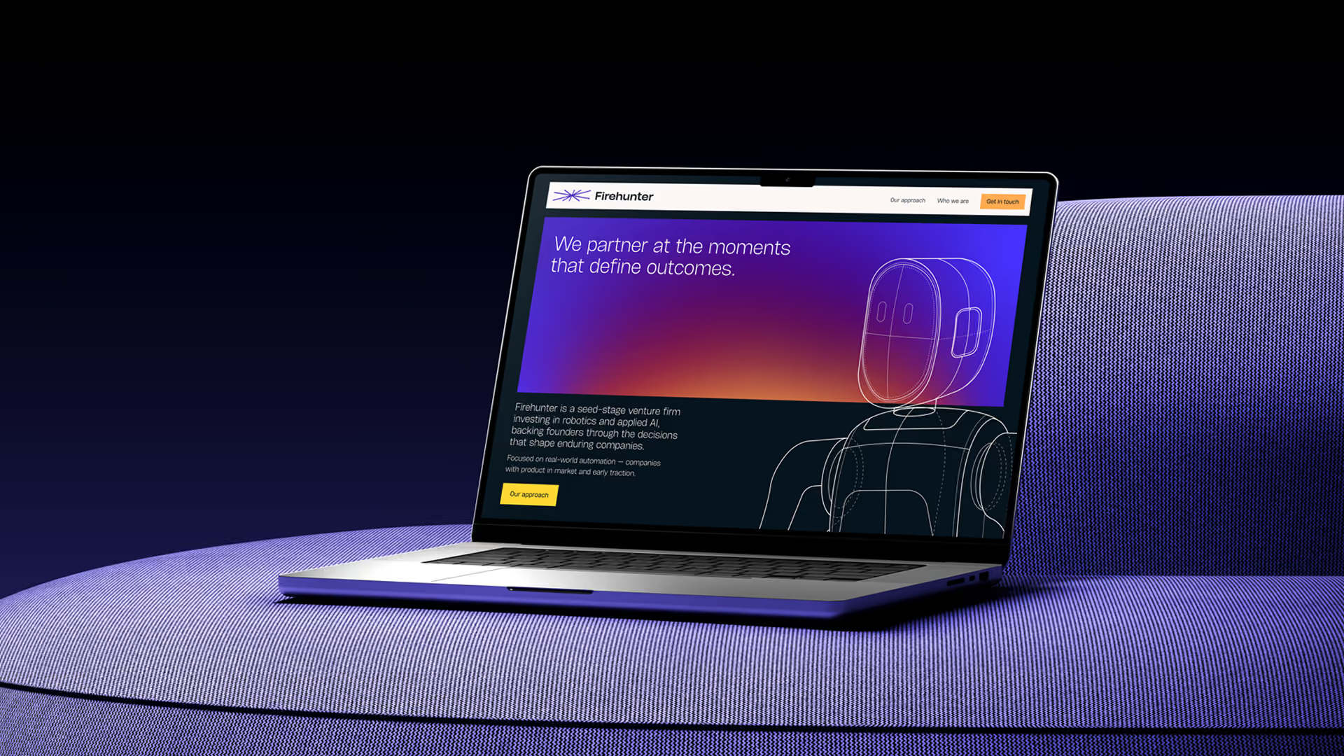
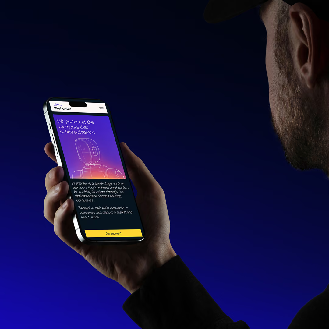
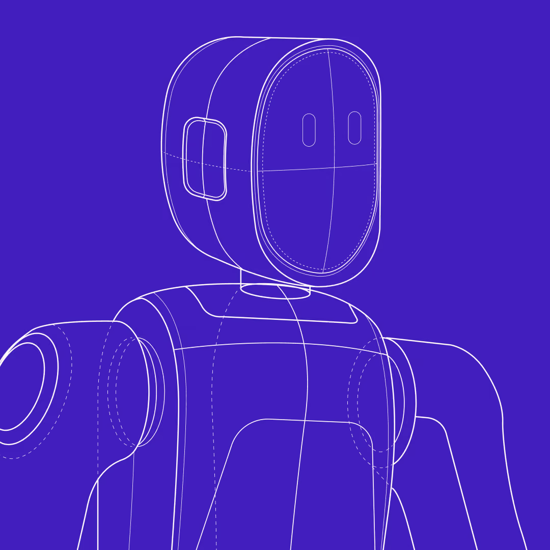
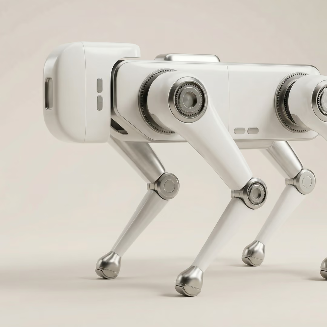
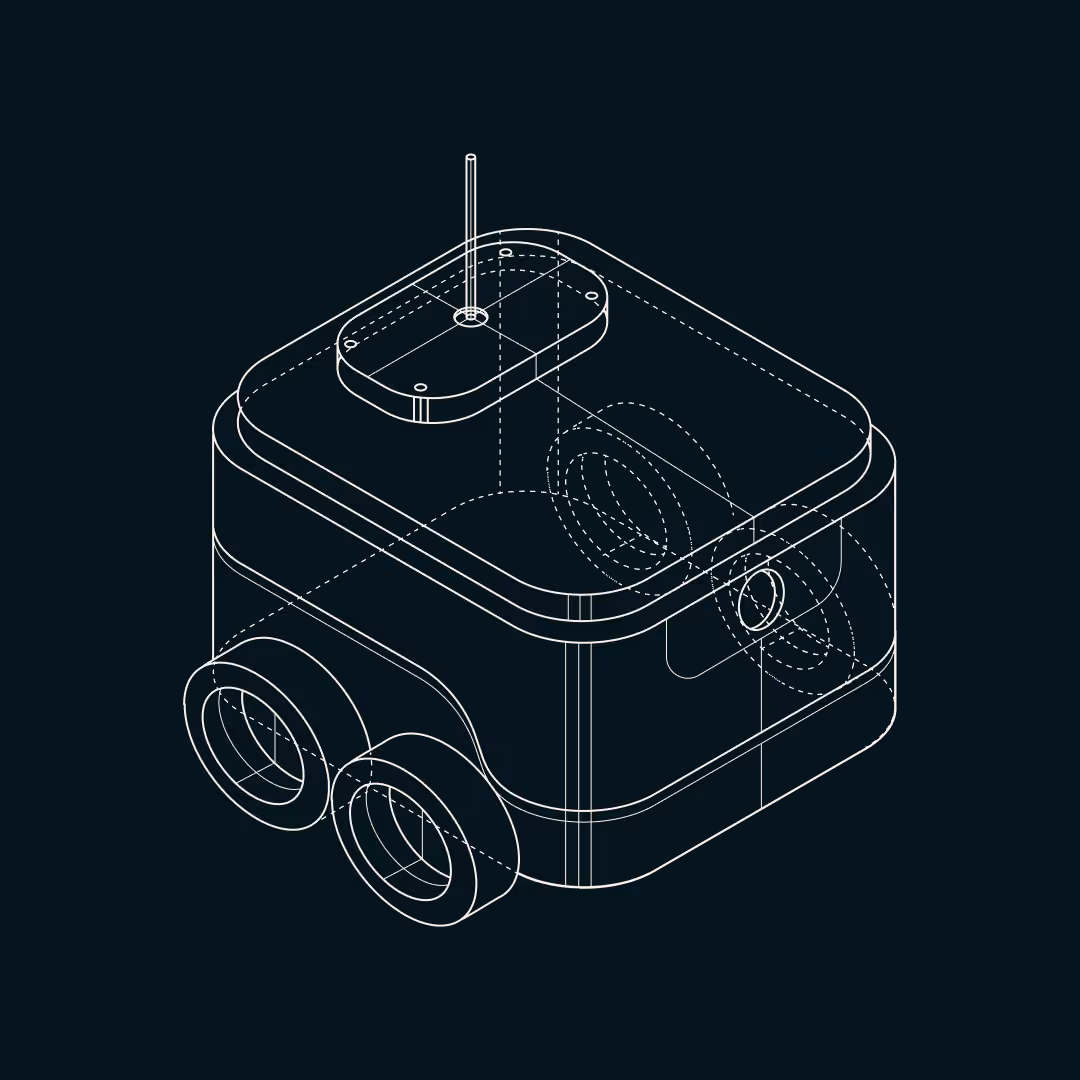
Illustrations became a defining element. Our team developed a suite of custom engineering-style line drawings of robotics hardware, a humanoid torso, a quadruped robot, schematic details, grounding the brand in the physical world of the companies Firehunter invests in. Then, using those blueprints as source material, generated photorealistic AI renders of the same subjects. That pairing, the sketch and the realized product, became the visual thesis of the site.
A site built for two audiences at once
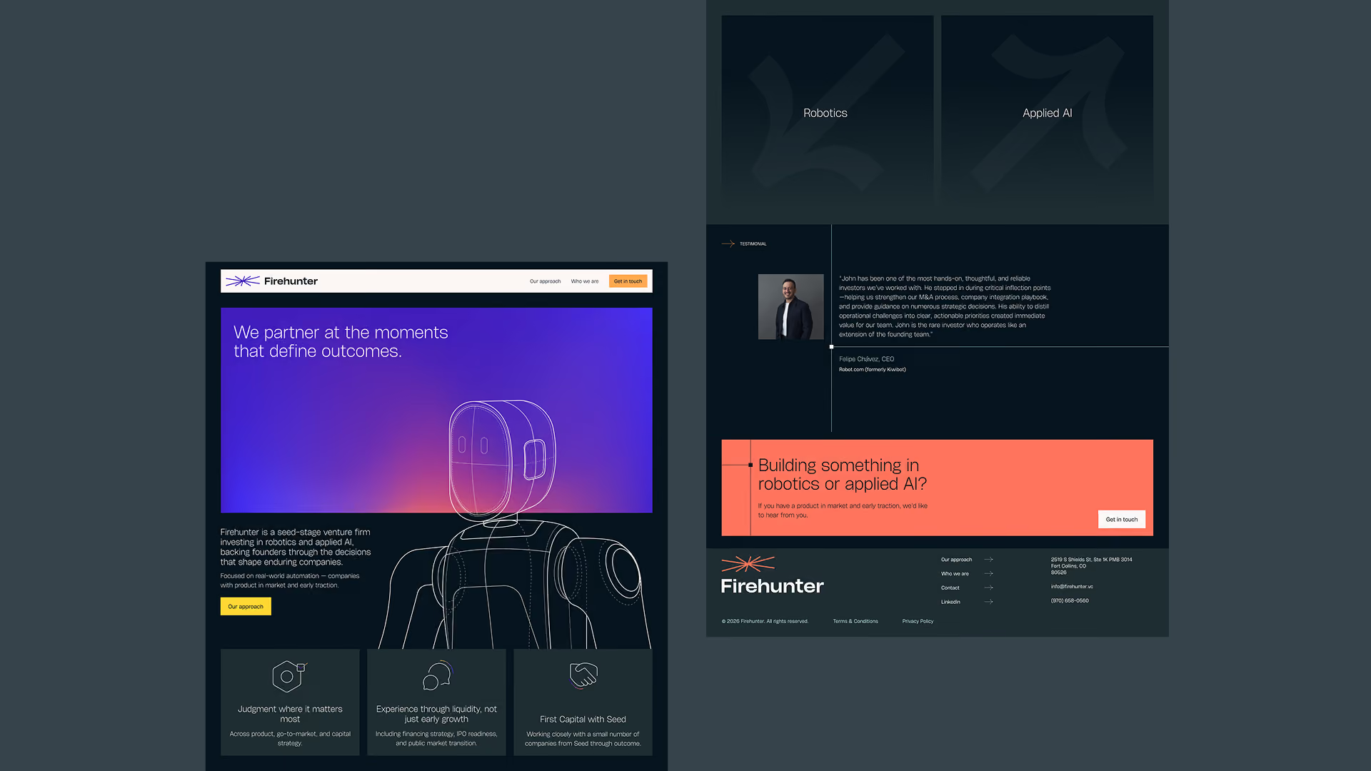
The website had to serve LPs evaluating a new fund and founders deciding whether to take a call. Those audiences want different things, but the underlying question is the same: can I trust this firm?
The homepage leads with the firm's positioning on the intersection of robotics and applied AI, then moves through what Firehunter offers, how it works, and why John's background makes the firm different from capital-only investors. The copy set the tone for the site with its direct, unhierarchical, spoken as a peer rather than broadcast from authority tone. The hero section uses a scroll-driven 3D animation. A humanoid robot, rendered from our original blueprint drawing, rises into frame and turns to face the key copy block as the user scrolls down. It directs attention to the most important text on the page, the lines that explain what Firehunter is and does. The blueprint-to-render transition plays again deeper in the site, this time as the user scrolls from illustration into a photorealistic image. Testimonials anchor the site. providing social proof and validating the operational depth John brings as an investor partner.


Wunderdogs have nailed what I was looking for. I'm just blown away.
Founder & Managing Partner @ Firehunter






Other works that you might be interested in


.svg)




.svg)

.svg)
Get insights from growing 250+ brands
