The Center for Civic Futures
The Center for Civic Futures needed to feel like something new, both technically credible and future-facing, but grounded in the complex human reality of how government actually works.
Our starting belief was that trust was the single most important quality for the organization that couldn't be faked through warm colors and friendly illustrations. It had to come from clarity and intention, looking like someone had thought carefully about every decision and made each one for a reason. We weren’t trying to please everyone, but were confident enough in connecting to what people would immediately recognize as theirs.
Reading the room
We ran multiple rounds of discovery with the Center's leadership to understand organizational context and ambition, brand personality, visual preferences, and audience dynamics.
What surfaced quickly was the tension at the heart of the organization. The Center serves two fundamentally different audiences. State health and human services leaders come to them through the lens of program delivery. They're thinking about policy, backlogs, the human impact of systems that aren't working. State AI advisors, appointed by governors to define technology strategy, come with a completely different frame. They seek to understand capabilities, infrastructure, and what agentic AI might mean across multiple programs. The brand needed to feel like a home for both, without watering itself down for either.
The political dimension was an equally important aspect. The Center works in 40 states, across party lines. Several team members had come from organizations that had been tagged as politically liberal, and had seen firsthand how that perception closes doors. Colors, imagery, even the types of people shown in photographs had become politically divisive in ways that wouldn’t have mattered a decade ago. Our approach was clear, non-partisan can't just be a talking point. It had to be the first thing someone felt when they encountered the brand.
A less expected insight emerged around a sense of place. These government leaders carry deep pride in the states and communities they serve. A secretary in Arizona is thinking about kids in Arizona. A tribal leader is thinking about their nation. The team felt strongly that the brand should somehow make people feel like they could see their community in it without falling into anything that felt partisan or exclusionary.
Where we saw opportunity
We audited a cross-section of organizations across the Center's competitive landscape from civic tech nonprofits like Code for America, Nava, and Civilla, to government associations like APHSA and NASCIO, to adjacent players like the Aspen Institute and Beeck Center.
The first thing we did was strip everything back to color. Laid out the palettes side by side. The category was strikingly uniform in tone, feeling heavy, saturated, and serious. Blues and purples dominated, borrowing from the SaaS playbook. Nothing felt light, nothing felt modern in a way that would gain attention.
Logos told a similar story. Almost universally bold, sans-serif, stamped. There were very few logomarks and almost no typographic nuance or personality. The visual languages relied heavily on stock photography or generic illustrations of everyday people interacting with government services. It all blurred together.
From insight to application
We began the creative process by developing three creative territories, each designed to test a different balance of the tensions we'd identified.
The first, Human + Tech Hybrid, explored organic forms layered with structured grids and system overlays. Gradient palettes suggesting fluidity and evolution. Abstract imagery that felt neither clinical nor whimsical. It was the territory that most directly addressed the intersection the Center occupies.
The second, Catalyst for Change, pushed toward editorial energy. Bolder typography, motion-inspired graphics, brighter and more unexpected color combinations. It had a storytelling quality that felt less institutional, more like a publication or movement. It felt alive, but risked tipping toward the protest aesthetic of organizations like Project Liberty, which wasn't right for an organization that needs to be welcomed into state offices, not picketing outside them.
The third, Future Grounded, was the most restrained. Clean compositions, layered photography with data overlays, heavy use of white space. This is where the nature imagery of landscapes that evoked specific American geographies without naming them. It felt credible and serious but risked feeling too reserved, potentially losing the approachability that HHS leaders need to feel when they arrive.
The team were drawn to the color and organic-tech intersection of the first, the storytelling energy of the second, and the place-based grounding of the third. What they rejected was equally useful. Anything that felt too protest-like, anything that leaned too heavily on a single color and anything that could be mistaken for yet another civic tech organization doing the same things with the same visual playbook.
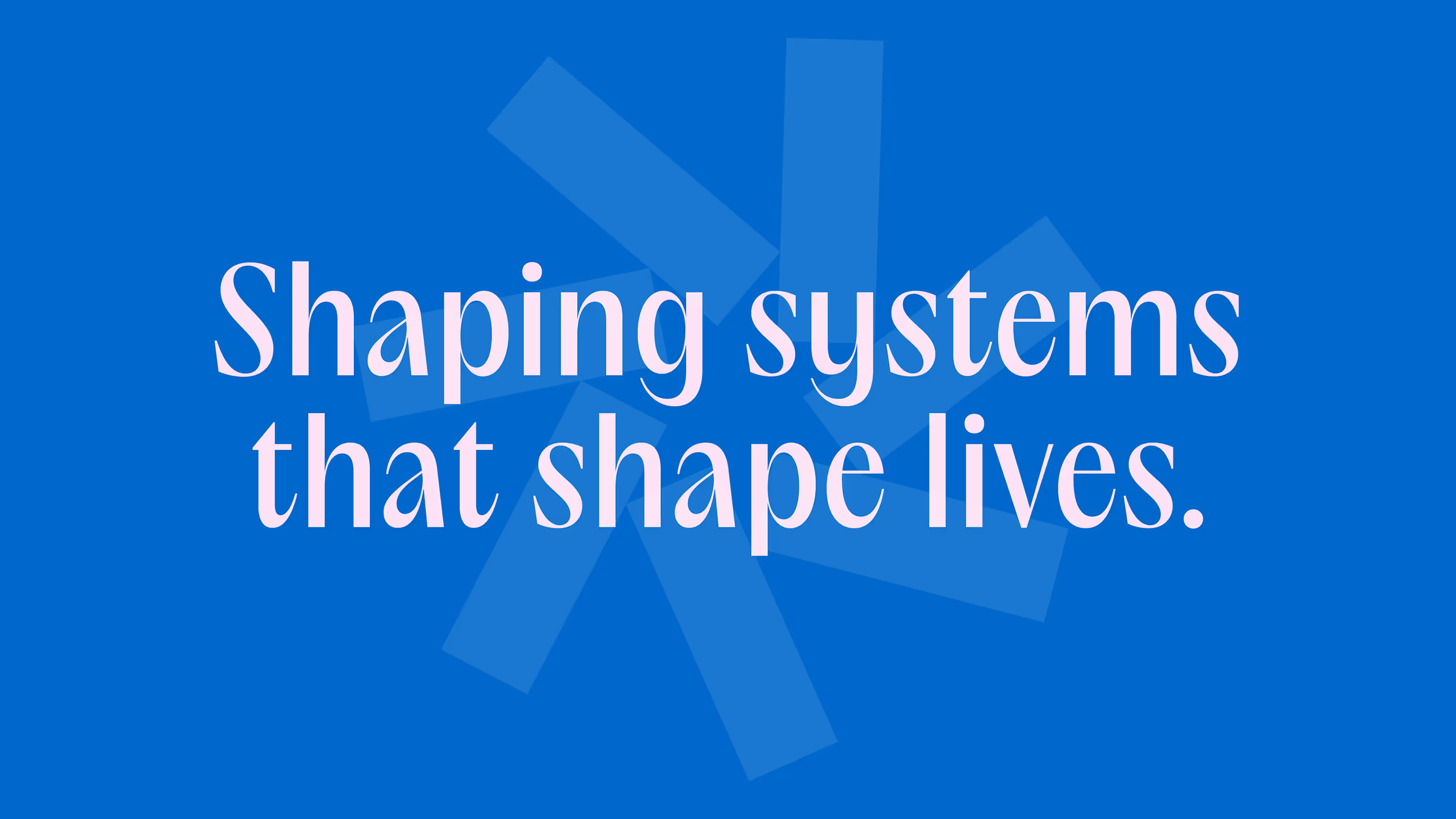
The final identity sits in the space between territories one and two, with the sense of place from territory three woven through the visual system.
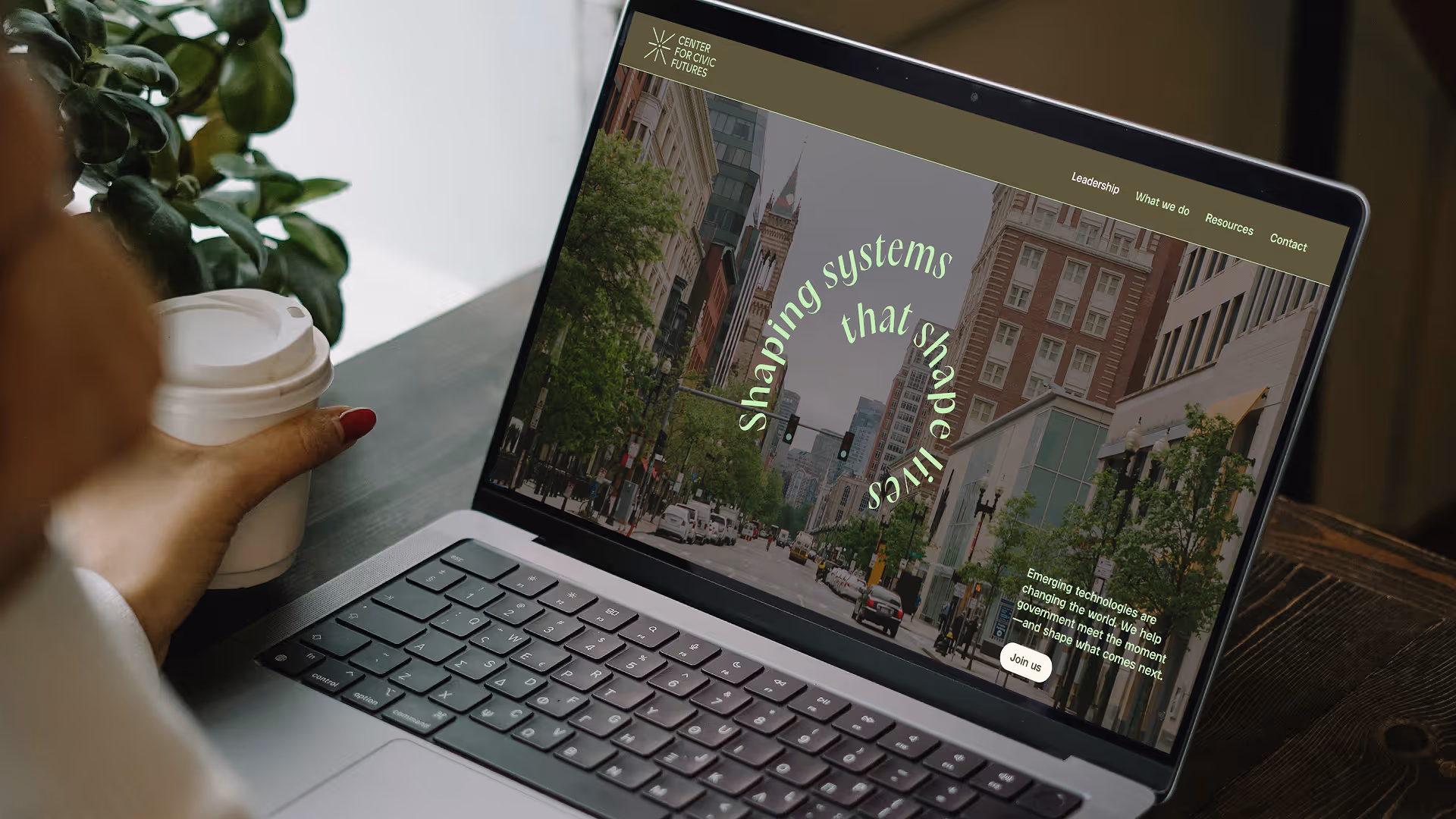
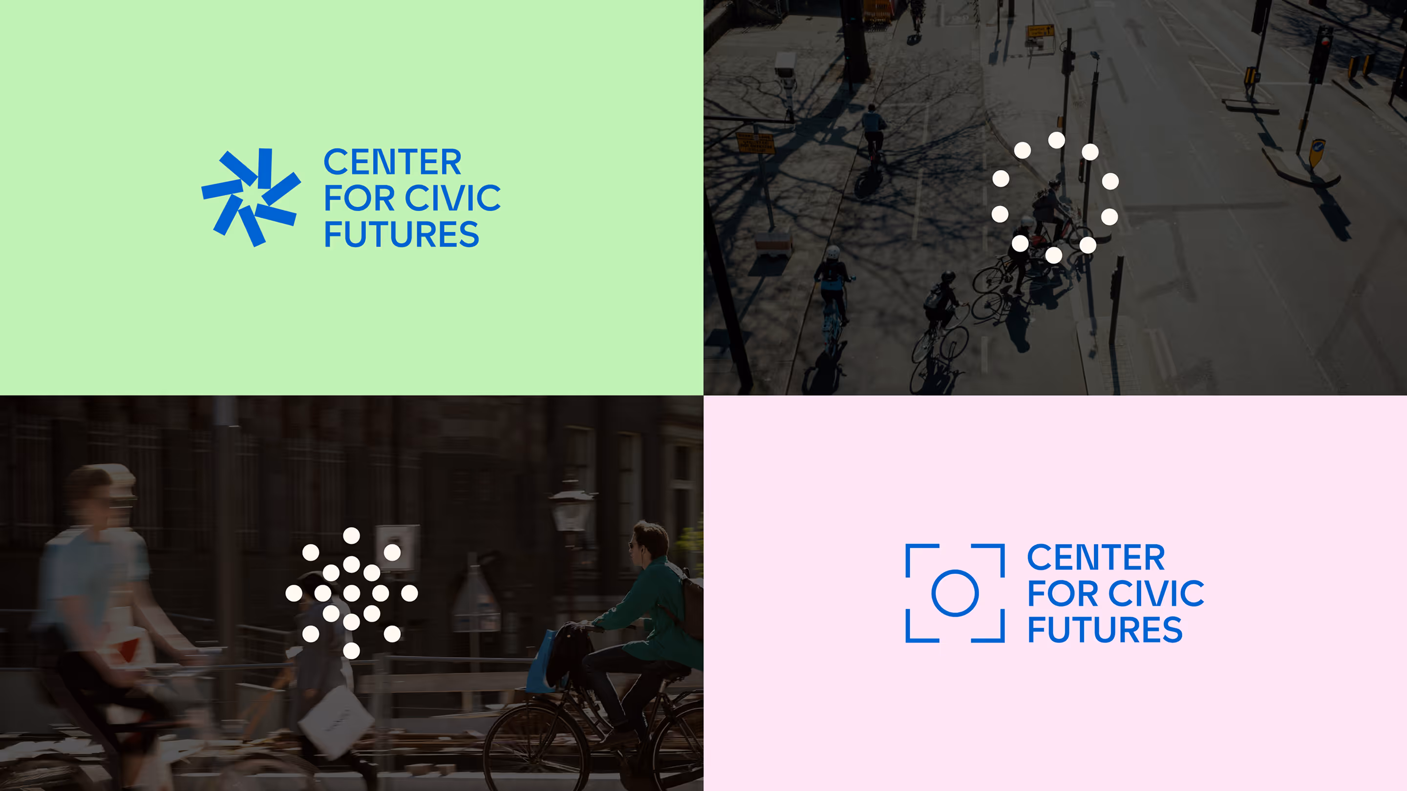
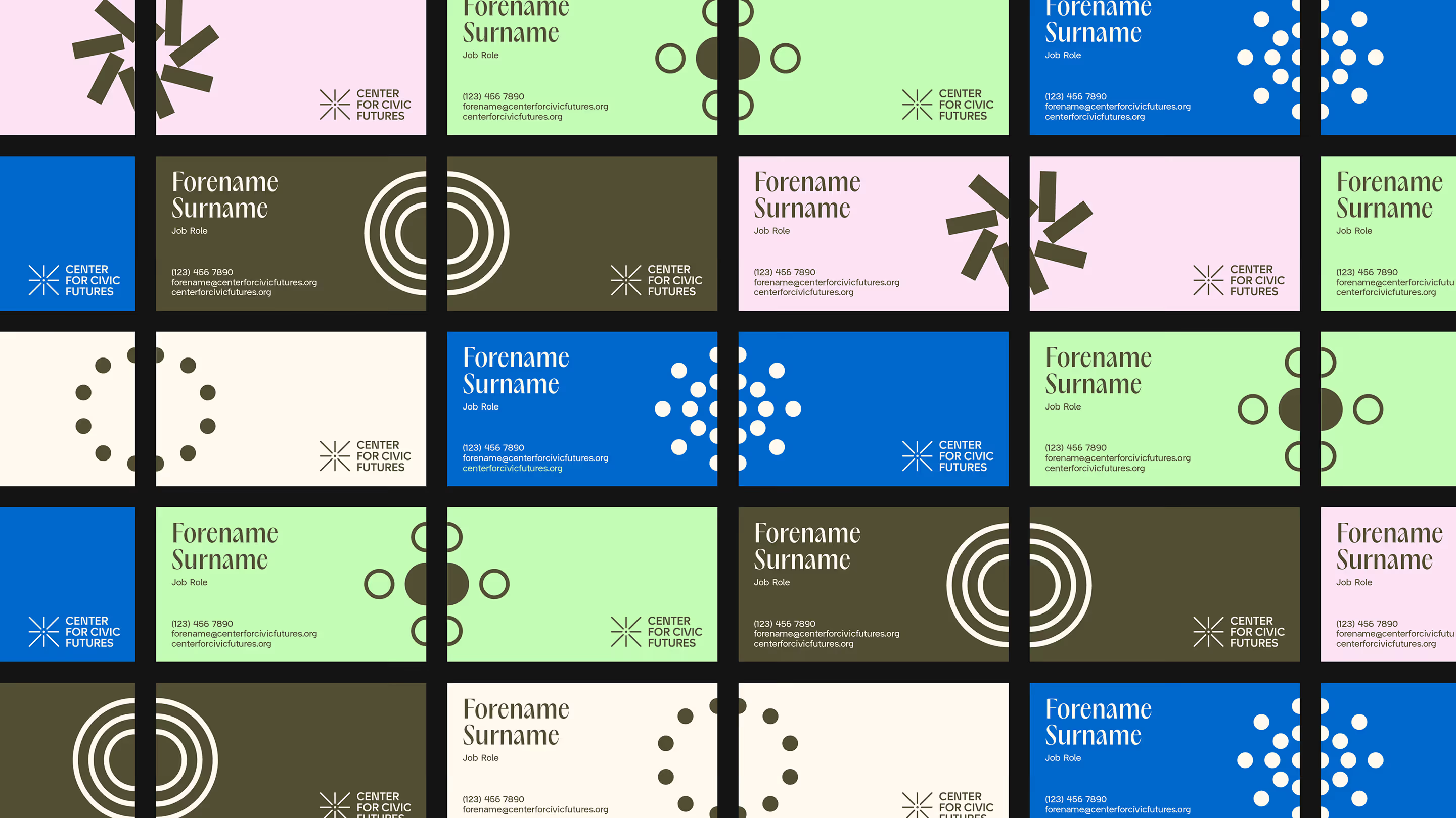
Logo: The logo was built to be a dynamic system of different logo marks that represent the reach of the center across communities, individual needs and technology integration. In digital settings the logo is animated, cycling through the different iterations. In print and static channels, the logo offers options to choose the logo mark that best represents the setting and audience being spoken to
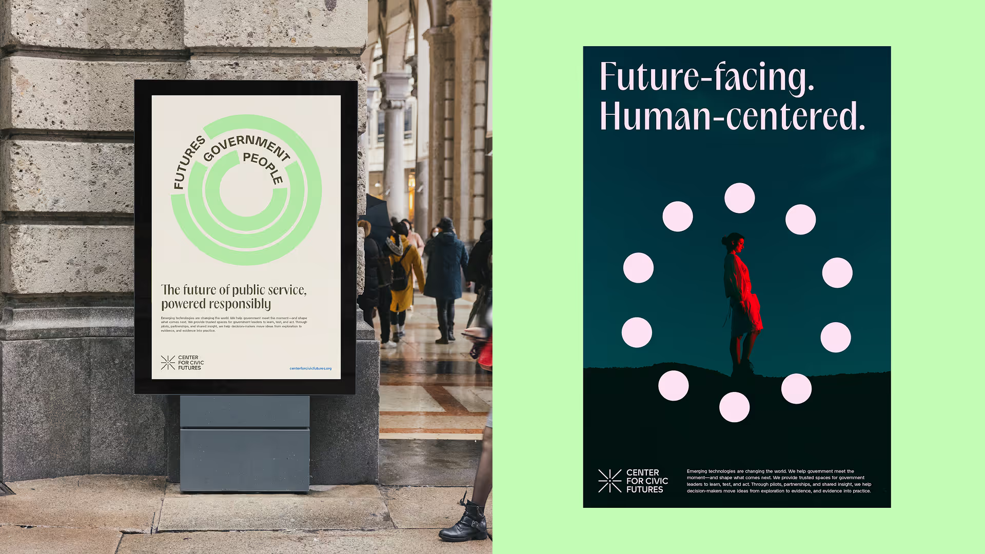
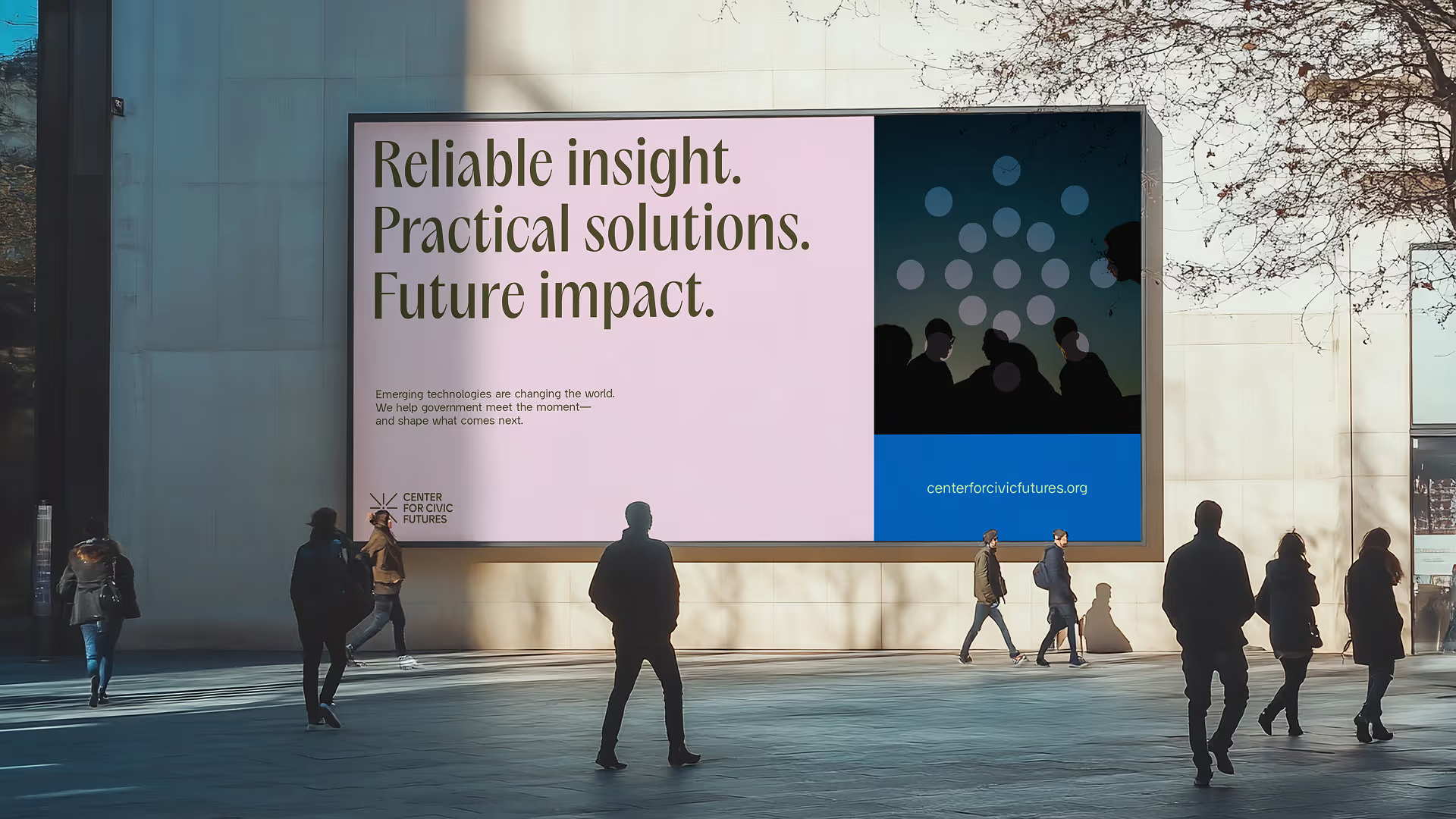
Colour: The colour palette draws on a combination of vibrant and natural tones to balance the tech and community relationships the brand enables. When brought together they bring a unique distinction compared to the rest of the market while avoiding the partisan or patriotic direction of many others.
Typography: The combination of Acma for headlines and Guaruja Grotesk for subheads and body was chosen to create harmony between a serif and sans serif style, in part to connect the modernity of technology and tradition of government. It also offered the brand flexibility to create assets that feel dynamic and ownable.
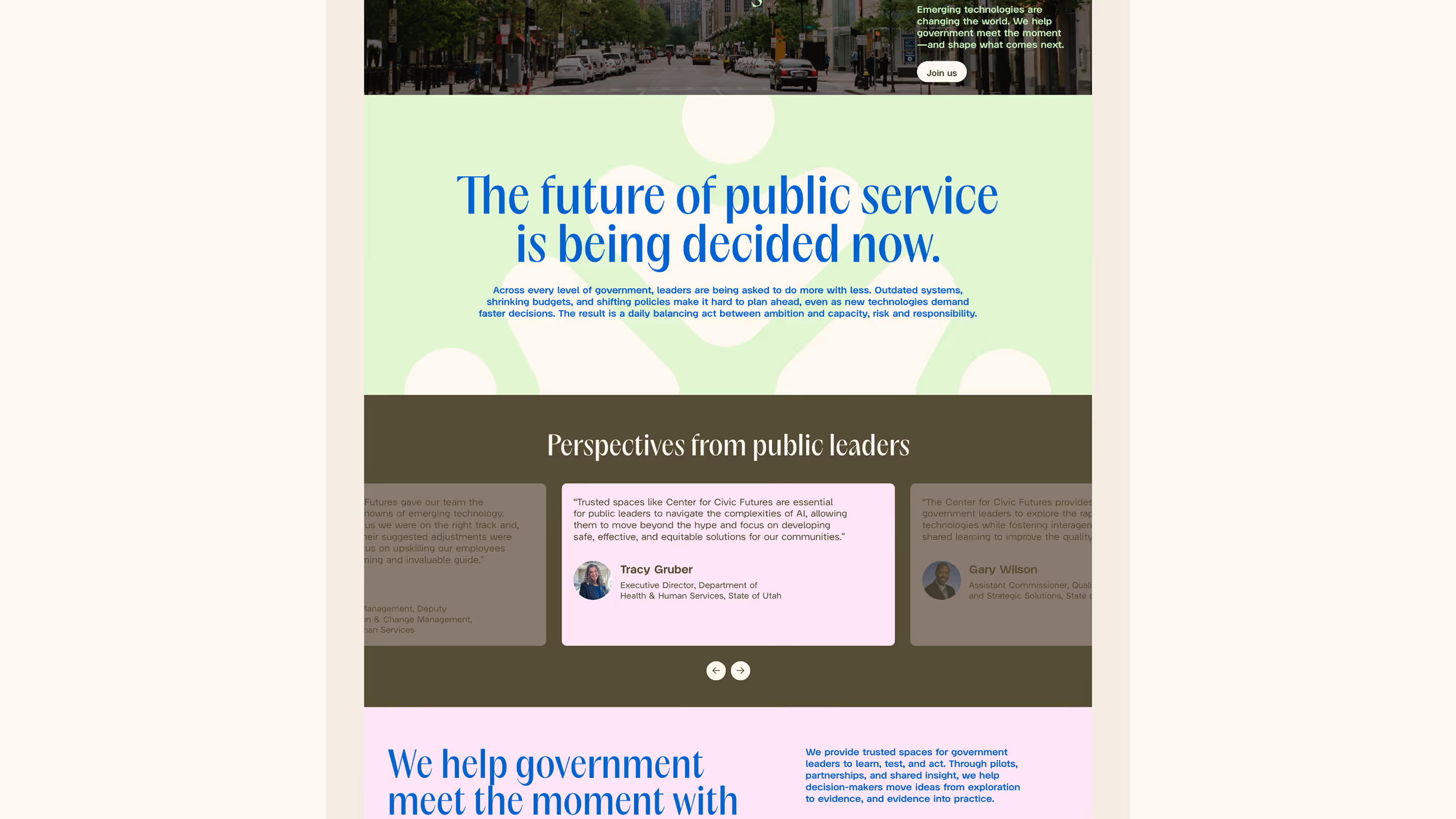
Imagery: Our first priority was to bring the audience into the brand. Not government or technology leaders but the individuals and communities that are impacted by the guidance and choices made by the Center. An editorial style to imagery conveys confidence and humanity in a way that feels real, not posed, not stock, but the reality of communities across the country. We also sought imagery that would represent different geographical locations that felt recognisable but not cliche to illustrate the reach of the center without feeling tied to a single location.
Visual language: To bring core assets together as a cohesive system, we developed a visual language that expands from the dynamic logo mark. Using the icon set overlaid on images creates focal points that draw attention to the people and communities the center is focused on. We leaned on editorial principles to create spaces for engaging storytelling that feel modern but not alienating.
Building an enabling brand
Every decision in the system links back to a strategic need. The color palette is nonpartisan by design, tested against the political associations the team flagged in discovery. The typography balances warmth with authority, flexing between audience contexts without needing to switch systems. The visual language supports the Center's dual constituencies through a single, coherent identity rather than separate tracks that splinter the brand.
Part of our brief was to develop a website that could translate this into a digital experience built around practical value. The architecture creates clear pathways for HHS leaders and AI advisors without segregating them, reflecting how the Center actually operates. The platform is built to scale alongside the Center's expanding programming, including a Rockefeller-funded resource hub and growing library of frameworks and playbooks.
The Center for Civic Futures came to Wunderdogs to close that gap, to build a brand and digital presence that matched the scale, seriousness, and ambition of what they'd already built: "We are in 40 states. We are sprinting and doing this high-quality work that no one's doing. And if you look at our brand, it doesn't say it at all."
Civic tech has an identity issue. It either looks like government - dry, institutional, forgettable - or it borrows from Silicon Valley and ends up feeling slick but disconnected from the people it's serving.
The Center for Civic Futures is doing work that genuinely matters, building infrastructure for trust between government and technology at a moment when both are under enormous pressure.
The old brand was getting in the way of that work.
The new one gives the organization a platform to show up as it was intended; serious, human, future-facing, and already operating at a scale that most people in the space haven't caught up to yet.

Other works that you might be interested in

.svg)
.avif)

.svg)