Our birthday month calls for some reflection — on how far we've come and where we're headed next.
Five years ago, we were a small and scrappy team of creatives based in the Dogpatch neighborhood of San Francisco. Since those early days, we've been united by our passion for fast-moving early-stage startups and the groundbreaking technologies that they pioneer. This passion inspired our name — Wunderdogs — and the big idea behind it: helping underdogs become big dogs by doing wonders.
We've come a long way since then. Here are the five long roads we've skipped along in these five short years:
- We've transformed our offering. When we started, we limited ourselves to brand design services. We soon realized, however, that the need was much larger. Over time, we grew to provide a full range of services to help teams build, launch and grow their brands at a pace of a scaling organization. Through the years, we've refined this process by helping over 50 companies scale and over 100 more to build and sustain their brands.
- We've expanded our team. An exceptional range of services requires an equally exceptional team to deliver them. In five years, we went from a team of two to a global team of over 20, spanning three continents and bringing together varied expertise and outlooks. We're graphic and digital designers, copywriters, strategists, engineers, and fundraising experts — remote and diverse by design.
- We've built partnerships. We've teamed up with 30+ global accelerators, VCs, and media organizations of our dreams. They now help us share everything we learned about building brands and communicating their value. We use this platform to support technology founders.
- We made our mark. Through our hard work and dedication, we've gained recognition through 25+ international awards. We've been featured on FastCo, Forbes, Entrepreneur, and others. We're proud of our work and want to continue sharing it with the world to inspire everyone to build incredible brands.
- We've finally grown into ourselves. 5 years old is 35 in dog years, so we've matured and fully processed who we are in the community we've built and what we add to the world. By drawing on the dual synergy of tech and creative, we help people solve big challenges by communicating them effectively to the world.
Having gone through this journey through building brands and helping bridge the world of tech with the wider world, it became apparent that we needed to add one crucial missing piece: an update to our own brand.
So we rebranded ourselves.

Strategy
Our brand strategy is an encapsulation of everything we know about ourselves, the world, and our clients and partners within it.
We see ourselves as the guides at the crossroads between technology and creativity—the path beyond leads to an exciting journey through vibrant communities toward an exciting place in the spotlight. But for many of those standing at the crossroads, it's their first time making this journey. So we place ourselves right there to welcome people into the world of branding and set them up for success on the journey ahead.
We also inspire people on their journey toward the crossroads and beyond. By nurturing partnerships across the board, we amplify our vision and spread ideas that become kernels of impactful brands.
Visuals
As an agency, it's typical, even expected, for clients to be front and center. We, therefore, wanted our identity to be a container for multitudes: one that can seamlessly switch between being bold and all about our brand to one that is subtle and minimalist to highlight our clients' brands.
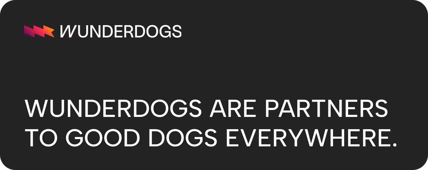
The logo reimagines a flag: a representation of our global, multinational team and evocative of summiting a mountain, leaving a mark at the top. This reflects our dedication to unity in multitudes and to helping all those we work with truly unleash their wildest potential. As a bonus, the flag is subtly reminiscent of a W — a nod to our name.
The colors are bold, bright, and high-contrast. The warm, glowing purple-to-yellow gradient is integral to our color palette. We call it our Blast Off Gradient as it propels everything forward, giving it momentum to reach new heights. It's also a visual bridge between the purple world of tech and the warm yellow world of creativity.
Our key visuals are primarily composed of prominent geometric elements that we can use as containers for our clients' brands or combine with our bold colors to place ourselves in the spotlight.
For typography, we wanted to focus on minimalism, subtlety, and accessibility. There is, however, a little Easter Egg in there, and we'll tell you about it since you've read this far! The W in "Wunderdogs" is slanted. It goes against the grid — but not because we're contrarian. It's because we value imperfection — it's where we find inspiration and the most unexpected solutions to the toughest challenges.
So there you have it! Please welcome the new Wunderdogs identity, designed to represent everything we stand for, and continue growing with us. We'd love to hear what you think.

Our birthday month calls for some reflection — on how far we've come and where we're headed next.
Five years ago, we were a small and scrappy team of creatives based in the Dogpatch neighborhood of San Francisco. Since those early days, we've been united by our passion for fast-moving early-stage startups and the groundbreaking technologies that they pioneer. This passion inspired our name — Wunderdogs — and the big idea behind it: helping underdogs become big dogs by doing wonders.
We've come a long way since then. Here are the five long roads we've skipped along in these five short years:
- We've transformed our offering. When we started, we limited ourselves to brand design services. We soon realized, however, that the need was much larger. Over time, we grew to provide a full range of services to help teams build, launch and grow their brands at a pace of a scaling organization. Through the years, we've refined this process by helping over 50 companies scale and over 100 more to build and sustain their brands.
- We've expanded our team. An exceptional range of services requires an equally exceptional team to deliver them. In five years, we went from a team of two to a global team of over 20, spanning three continents and bringing together varied expertise and outlooks. We're graphic and digital designers, copywriters, strategists, engineers, and fundraising experts — remote and diverse by design.
- We've built partnerships. We've teamed up with 30+ global accelerators, VCs, and media organizations of our dreams. They now help us share everything we learned about building brands and communicating their value. We use this platform to support technology founders.
- We made our mark. Through our hard work and dedication, we've gained recognition through 25+ international awards. We've been featured on FastCo, Forbes, Entrepreneur, and others. We're proud of our work and want to continue sharing it with the world to inspire everyone to build incredible brands.
- We've finally grown into ourselves. 5 years old is 35 in dog years, so we've matured and fully processed who we are in the community we've built and what we add to the world. By drawing on the dual synergy of tech and creative, we help people solve big challenges by communicating them effectively to the world.
Having gone through this journey through building brands and helping bridge the world of tech with the wider world, it became apparent that we needed to add one crucial missing piece: an update to our own brand.
So we rebranded ourselves.

Strategy
Our brand strategy is an encapsulation of everything we know about ourselves, the world, and our clients and partners within it.
We see ourselves as the guides at the crossroads between technology and creativity—the path beyond leads to an exciting journey through vibrant communities toward an exciting place in the spotlight. But for many of those standing at the crossroads, it's their first time making this journey. So we place ourselves right there to welcome people into the world of branding and set them up for success on the journey ahead.
We also inspire people on their journey toward the crossroads and beyond. By nurturing partnerships across the board, we amplify our vision and spread ideas that become kernels of impactful brands.
Visuals
As an agency, it's typical, even expected, for clients to be front and center. We, therefore, wanted our identity to be a container for multitudes: one that can seamlessly switch between being bold and all about our brand to one that is subtle and minimalist to highlight our clients' brands.
The logo reimagines a flag: a representation of our global, multinational team and evocative of summiting a mountain, leaving a mark at the top. This reflects our dedication to unity in multitudes and to helping all those we work with truly unleash their wildest potential. As a bonus, the flag is subtly reminiscent of a W — a nod to our name.
The colors are bold, bright, and high-contrast. The warm, glowing purple-to-yellow gradient is integral to our color palette. We call it our Blast Off Gradient as it propels everything forward, giving it momentum to reach new heights. It's also a visual bridge between the purple world of tech and the warm yellow world of creativity.
Our key visuals are primarily composed of prominent geometric elements that we can use as containers for our clients' brands or combine with our bold colors to place ourselves in the spotlight.
For typography, we wanted to focus on minimalism, subtlety, and accessibility. There is, however, a little Easter Egg in there, and we'll tell you about it since you've read this far! The W in "Wunderdogs" is slanted. It goes against the grid — but not because we're contrarian. It's because we value imperfection — it's where we find inspiration and the most unexpected solutions to the toughest challenges.
So there you have it! Please welcome the new Wunderdogs identity, designed to represent everything we stand for, and continue growing with us. We'd love to hear what you think.


.svg)
.avif)
.avif)
.avif)
.svg)