Last week social publishing online platform, Medium revealed their new brand identity as a part of a series of upgrades rolled out over the past few months, said by VP of Marketing Karene Tropen, to help build a more relational and expressive platform for its creators.
This would also be Medium’s third rebrand since launching in 2012, which we find intriguing. On the one hand, multiple rebrands within shorter periods usually lessen a brand’s image as consistent and reliable. On the other hand, Medium is an incredibly fast-developing company within a fast-moving industry: should this pace of rebranding become more normalized?
Using Karene’s words, Medium’s new logo “is born from the ellipses: a punctuation mark that represents an unfinished or impending thought, an idea to come, what’s next. This is, again, what happens on Medium — there’s always a new idea, always more to the story.”

The Medium rebrand makes sense and works to position the platform as a space for real, human dialogue within the tech industry. We also find it very timely, given that more than ever, we need as many ways to facilitate social interaction as possible while we are all locked up in our homes with our laptops.
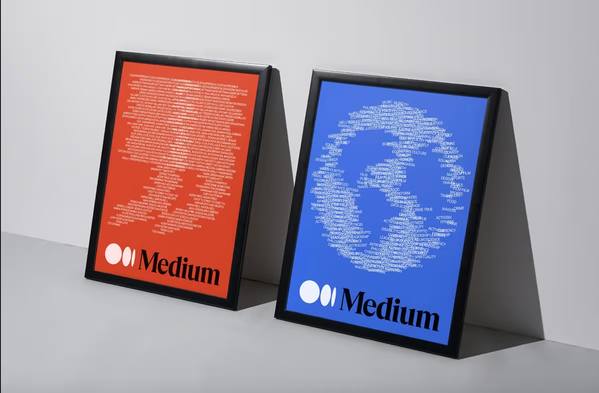
As big proponents of all things dynamic, we really enjoy the imagery and illustrations that aptly depict a connection between human discourse and tech. We also like this new identity’s simplicity and minimalism, which is an excellent metaphor for Medium being a “container for thought” and a space to fill in with the ideas of others.


Final wunderthoughts on the Medium rebrand:
Win: Aligning the visual identity to the business’s value proposition with a surgeon’s touch, being flexible in updating their brand with the industry pace
Loss: *Potentially* failing to build a consistent experience, having rebranded 4 times in 4 years
Last week social publishing online platform, Medium revealed their new brand identity as a part of a series of upgrades rolled out over the past few months, said by VP of Marketing Karene Tropen, to help build a more relational and expressive platform for its creators.
This would also be Medium’s third rebrand since launching in 2012, which we find intriguing. On the one hand, multiple rebrands within shorter periods usually lessen a brand’s image as consistent and reliable. On the other hand, Medium is an incredibly fast-developing company within a fast-moving industry: should this pace of rebranding become more normalized?
Using Karene’s words, Medium’s new logo “is born from the ellipses: a punctuation mark that represents an unfinished or impending thought, an idea to come, what’s next. This is, again, what happens on Medium — there’s always a new idea, always more to the story.”

The Medium rebrand makes sense and works to position the platform as a space for real, human dialogue within the tech industry. We also find it very timely, given that more than ever, we need as many ways to facilitate social interaction as possible while we are all locked up in our homes with our laptops.
As big proponents of all things dynamic, we really enjoy the imagery and illustrations that aptly depict a connection between human discourse and tech. We also like this new identity’s simplicity and minimalism, which is an excellent metaphor for Medium being a “container for thought” and a space to fill in with the ideas of others.


Final wunderthoughts on the Medium rebrand:
Win: Aligning the visual identity to the business’s value proposition with a surgeon’s touch, being flexible in updating their brand with the industry pace
Loss: *Potentially* failing to build a consistent experience, having rebranded 4 times in 4 years


.svg)

.avif)
.avif)
.svg)